
The ability to write, hence to preserve and share arbitrary words and thoughts is one of the most consequential breakthroughs in the history of mankind. It laid the technological basis for what we perceive today as culture, science and, in good part, economy. Yet, writing can fix much more than only words. This is an integral, but often overlooked part of it. The physicality of the medium interacts with and often enhances the purely textual message. These features, which go beyond the encoding of words, are called the secondary characteristics of writing systems. Starting out from a taxonomy of those secondary characteristics, the article looks in more detail at two non-typographic characteristics, ordering and punctuation. This short sketch of a cultural history of ordering and punctuation begins with the role of ordering in the initial invention of writing over its use across the millennia, then looks at punctuation. It ends with the contemporary use of emojis to encode emotions.
Published in 1989, Emigre magazine’s eleventh issue, Ambition/Fear: Graphic Designers and the Macintosh Computer, contains vivid artifacts of a discipline’s first encounter with digital tools. From the aesthetics of bitmaps to the expressive interventions made possible by new access to typesetting controls, not to mention the self-publishing venture of the magazine itself, this issue combines modernist and postmodern agendas in a model construction of text-based community. Looking closely at Emigre #11 and more passingly at later issues, this article analyses the technical, critical, and cultural production that would shape Emigre as a medium for typographic demonstration and discussion among peers.
Grafiek (1936–2000) was a Belgian graphic arts periodical published by KOLVO, the alumni union of the ‘Kunstdrukschool Sint-Lucas’ in Ghent. Focusing on the first 25 issues (1936–1948) this article is a first investigation of how the graphic style evolved at this school during the early period of the modern graphic design. Leading man of both the Kunstdrukschool and Grafiek was friar Jan Peeters, who tinkered a design method that served as a pedagogical instrument. His method was inspired (directly or indirectly) by the writings of modernist pioneers such as Jan Tschichold. For a Catholic designer in Belgium in the early twentieth century, shaping the new profession of the graphic designer that combined progressive (modernist) aesthetics with deep religious catholic incentives clearly was a struggle.
From the fifteenth to the eighteenth century, hand presses and movable type were used for book printing. The knowledge of historical lead-based types, from a material point of view, is relatively scarce. The conservation of type in the Museum Plantin-Moretus (Antwerp) drew attention to the corrosive behavior of some types. To investigate the relation between the type compositions and the environment, contemporary literature on type alloying and casting was compared with analytical research on a selection of historical type. As a conclusion, lead alloy compositions with high concentrations of antimony and low tin levels were the most subjected to corrosion and are to be preserved in appropriate conditions.
Uitgaande van Marshall McLuhans analyse van de effecten van het gedrukte boek op de mentale en sociale omgeving van lezers, vraagt Arjen Mulder zich af of er bij het nieuwe medium van het e-book andere sociale en mentale effecten optreden. Het e-book is de drager van een immateriële tekst en biedt de lezer de mogelijkheid om de vormgeving en lay-out zelf te bepalen. Daarnaast bevat het e-book niet slechts de tekst van een boek, maar een complete bibliotheek. En, meest opmerkelijk, het kan bovendien worden gebruikt als online boekwinkel. Een ander opvallende effect is de afstand die ontstaat tussen de leeservaring van de tekst en de gebruikservaring van het medium. Mulder analyseert ook een aantal negatieve kwaliteiten van het e-book op grond van de technische eigenschappen van dit nieuwe medium. Zoals de onbetrouwbaarheid van de tekst en de drager, en het feit dat de provider ongewenst de e-reader kan her-initialiseren waarbij een heel assortiment van opgeslagen teksten zomaar blijkt te verdwijnen. Mulder besluit met een algemene theorie over de verschillende leeswijzen (reading modes) die lezers ter beschikking staan bij het verwerken van gedrukte en elektronische teksten.
Effective, appropriate and safe usage of medicines is only possible if they come with clear instructions, recommendations, descriptions and warnings. Clear information about medication does not only benefit seniors, who consume the greatest amount of prescription drugs, but also users in other age groups, such as children and their caretakers. The typographic design of this information plays a crucial role, but is, unfortunately, rarely optimized to suit different reading audiences’ needs. Still commonly seen are poorly readable patient information leaflets with ‘small font on translucent paper’ stowed in generic paper packaging.
The lacking typographic design can mostly be explained by historically determined legal and economical requirements. European legislation, for example, demands a conservative approach, mainly to reach standardization. The pharmaceutical industry is hesitant, out of fear that the changes will come at high costs. Both explanations make it difficult to meet the professional principles of typographic designers striving for optimized transfer of information. This is the crux of the matter, the reason why convenient, readable medication information leaflets are in short supply.
This article examines two underlying questions. When it comes to drug information, there have been three pivotal changes in society: patients are more actively involved in their own treatment; patients’ cultural backgrounds are more diverse; and there is a growing demand for digital information. The first question is: why have these changes in society barely made an impact on the typographic design of information leaflets? The second question is: why is existing professional knowledge hardly utilized, such as insights into readability, or the practical knowledge and experience developed for the pharmaceutical industry by prominent representatives of the Swiss Style (= ‘International Typographic Style’)?
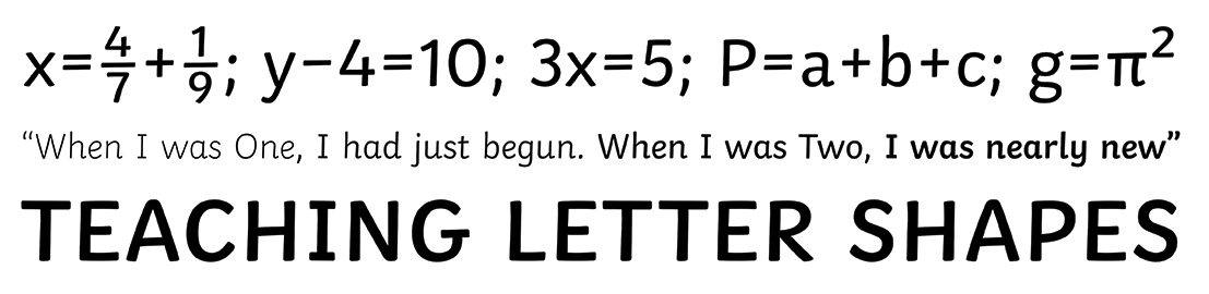
This article deals with the contrasting views of designers, educationalists and scientific legibility researchers concerning children’s typefaces. Guidelines about typefaces and their legibility for beginner readers remain inconclusive due to these different perspectives. The article first discusses the opinions of each of these parties on children’s typefaces. Educationalists’ views are often based on prejudices and forces of habit. Designers tend to follow the views of their potential clients and scientific legibility researchers often lack typographical knowledge for creating valid test material. To conclude, a new perspective on a need for collaboration between the different parties within typographic design research is suggested. This approach might be able not only to acquire a deeper understanding and explanation of the question which typefaces are best for children, but also for the development and design of concrete new, functional typefaces and/or guidelines.
This essay discusses the proposed design for informational objects for the place branding of the Food Innovation Strip Ede-Wageningen. The Food Innovation Strip Ede-Wageningen is the knowledge center of the FoodValley Region, one of the regions taking part in the top sectors policy, developed in 2011 by the Dutch government. The branding aims to convincingly convey that this region holds many companies, organizations and knowledge institutes working together towards sustainable innovations for the Agri-food sector within the framework of healthier food and a healthier living environment. This essay offers an inside view, from concept development to prototype, of the research behind the spatial and typographical design for the informational objects for the Food Innovation Strip. Although Agri-food is the primary focus for the design, the research is also based on information about typography and how typography is implemented in related fields such as illustration, spatial design and design in the context of new media.
This article studies the conception of the typographer in the French graphic design magazine Arts et métiers graphiques, published in the interwar period. For the magazine’s editors, the designer was both an artist and a trained craftsman who was dedicated enough to face the particular challenges posed by typography. Moreover, the fruit of his work merited legal protection through copyrights. All of this points to a conception of the designer as a self-determined individual with a particular style. This view may be typical of the French conception of modern typography in that period. It is one that stands in contrast to the logic of often anonymous, collective design propagated in the New Typography of the Central-European avant-gardes. Moreover, in addition to individual creative endeavours, the French conception favoured a design practice that reconciled innovation and tradition, and artistry and craftsmanship.