
Graphic design was the first creative industry to be transformed by the personal computer. What can we learn from an examination of graphic designers’ introduction to Macintosh workspaces? How did the discipline’s ideology — its history, self-conception and discourse — predispose it towards the potential and significance of the technological changes its practices experienced in the 1980s? Did modernist principles guide designers’ approaches to digital techniques? How might postmodern preoccupations have shaped their perception of these new tools? How do these initial perspectives map onto the evolution of a discipline’s relationship to new media from screen-based design for print to networked interaction?
Emigre magazine, founded in Berkeley, California, by Rudy VanderLans and Zuzana Licko in 1984, was one of the first journals to be designed and produced on the Macintosh.1 Not only did Emigre’s appearance call attention to its design, but its content tackled critical issues underlying practical, technical and cultural developments in the field. It thus presents a privileged locus for the study of digitisation’s impact on graphic design as a profession and as a cultural force.
Emigre also set itself up as a digital foundry, producing and distributing typefaces designed by Licko and others. As sites for the display of these faces, Emigre’s pages offered both demonstrations of, and reflections on, the state of typographic design. The textual community built and sustained by these pages — the venue that Emigre provided for debate among practitioners — may have been its greatest contribution to the advancement of graphic design as a mode of thought and a body of knowledge. As Emigre’s editor, designer and publisher, VanderLans clearly pursued his own interests and articulated his own views. However, since these views valued diversity, Emigre played host to a range of perspectives and practices, elevating the positions not only of contributors, but also of guest editors, guest designers, students and readers to public notice.2
Debuting as a cultural review, distinguished by its border-crossing sensibility rather than by any particular subject matter, Emigre began to focus on design in its ninth and tenth issues. Entitled Ambition/Fear, Emigre #11 proposed the discussion of ‘Graphic Designers and the Macintosh Computer.’ The issue consists of fifteen interviews conducted by VanderLans with an international circle of his contemporaries.3 Each interview is labelled with the name and location of its subject and the date it was conducted.4 Together, these exchanges comprise a time capsule containing vivid artefacts of designers’ first encounters with the personal computer as a design platform. VanderLans asked new Mac users to describe its impact on their working methods, analyse its aesthetics, and speculate about its creative and practical potential. ‘Digital technology is a great big unknown,’ VanderLans and Licko wrote in their introduction to the issue.5 Their sense of a space to be explored, which is reflected in the blurred and shadowy abstraction of the background imagery on the magazine’s cover, prompts an inquiry, the scope of which keeps the issue fresh today.
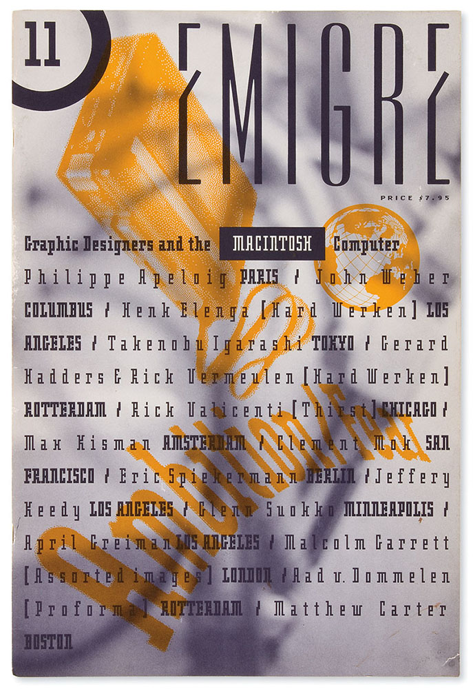
Source: Rudy VanderLans.
This critical space proves broader, and its exploration delves deeper, than a cursory look at the issue might conclude. Emigre #11’s attempts to take stock of the material and conceptual changes wrought by graphic design’s incorporation of digital production capabilities led directly to aesthetic considerations, which themselves were seen as having social implications.
The history of this techno-aesthetic concern, as well as the context and effects of its surfacing at the time of Emigre #11’s publication, merit analysis. This legacy involves design’s role as an interpreter and mediator of the social meaning of technology — a theme to which Emigre directed attention throughout its existence and which has retained its relevance. Moving beyond issue #11, this essay will survey the full run of the journal as a demonstration of the social potential of new media and of typography’s part in the testing and representation of this potential. Insofar as Emigre prefigured the use of digital media to support open-ended, peer-to-peer discourse, it holds lessons for a fully deployed typographic design practice today.
As Andrew Blauvelt noted in “Tool (Or, Post-Production for the Graphic Designer),” the arrival of digital tools in design studios ‘disrupted a field that has always had a rather confused and conflicted relationship between the spheres of creation and production.’ This disruption ‘eliminated the work of various production artists, photomechanical technicians, keyliners, paste-up artists, [and] typesetters (…),’ he wrote. Moreover, the software that encapsulated and, to varying degrees, automated the work of these specialists brought its settings and controls not just to graphic designers but also to non-professionals.
In Blauvelt’s analysis, this situation required the profession to tell ‘a new story about the value of design.’ Since the computer appeared to be a substitute for practical skills, ‘the answer was to be found not in production, but in the realm of conception (…).’6 In fact, this ‘story’ was more of a sequel than it was a new narrative.
As a profession, graphic design was partly born of the specialisation that began to separate layout from composition in print shops at the turn of the twentieth century — that is, of a greater space made for typographic planning as distinct from its execution by typesetting. Modern design in general emerged from this kind of separation, to which industrial conditions gave rise and which tended to divide traditionally integrated crafts into intellectual and manual labour.7
By the middle of the twentieth century, graphic design professionals had sold themselves as conceptual consultants to businesses whose visual identities, they argued, required systems-thinking and programmatic design. Given its fundamental relationship with the history and identity of the field, it is not surprising that what Blauvelt called a ‘segregation… between hand skills and head skills’ should remain ‘at the heart of much professional discourse and angst.’8 This division and the feelings surrounding it inflect the discussion that VanderLans initiated with his interviewees regarding how they were coping with the ‘task of integrating this new technology into their daily practices.’
This portion of the interviews begins with versions of the question, ‘Will the Macintosh change the way we design or will it only change production processes?’9 Equally central to VanderLans’ investigation, yet overriding this question’s categorical distinction (design versus production), another primary topic pertains to the new opportunities for integration and creative control offered by the incorporation of production processes — particularly typesetting — into early graphic design software.
While some of his colleagues professed themselves to be relieved of the ‘drudgery’ of such ‘troublesome chores’ as paste-up and were glad to bid farewell to the tedium of working by hand with technical pens, ‘wax and rubber cement and scissors,’10 others appreciated the Macintosh’s elimination of the time, space and expense imposed by the intermediary of the typesetter.
Insofar as design begins where conception distinguishes itself from realisation, modern design has by definition entailed the communication of one’s idea to be translated by another.11 From hand- and machine-setting for letterpress to phototype and electronic setting for offset, designers’ sketches and ‘mechanicals’, type specifications and other instructions were handed off to technicians to be set, proofed, and later ‘statted’.12 Process documents passing between designers and typesetters bridged a technical gap that the Macintosh effectively closed (The skills- and knowledge-gap occasioned by this transfer would take more time to shrink, as the experience of prepress operators was gained by digital practitioners).
Closure of this gap was a cause for celebration and source of inspiration for several of those interviewed in Emigre #11, whose design interests were served by the new intimacy, power and freedom afforded by direct access to the settings that generate type. Rick Valicenti, who was still learning to use his ‘machine’, said, ‘I would like to be able to sit down and manipulate my type (…) and structure it in such a way that I can see it before it’s all played out.’ He describes noticing a book that seemed to have been typeset by a designer using a Macintosh, who apparently was able to monitor the text’s rags ‘at the typographer’s level.’ Valicenti concluded from this example that the Macintosh would allow him to ‘become a better typographer.’
Similarly, Jeffery Keedy explained that the Macintosh ‘gives me control over typography. I can see it, set it and I don’t have to count on a typesetter translating my specs.’13 Thanks to this assimilation, for Glenn Suokko, ‘Working with the computer is more of an organic design process than an abstract one.’14
With regard to the Macintosh, Philippe Apeloig reported, ‘I can [move] one letter, a word, a line, or even an entire paragraph. I can experiment and immediately see how it looks.’15 Instant visualisation, perhaps the greatest boon to the design process offered by Macintosh’s GUI and WYSIWYG features, was particularly powerful where type was concerned, since the effects of specifying different sizes and styles of type could only be sketched or imagined to limited degrees.16
Several conversations touch on the trade-off between a decrease in time and money spent on stats on one hand and the cost of an increase in time spent in front of a screen considering options on the other.17 However, for designers with an affinity for type and a desire for more detailed textual intervention, the trade-off was a net gain. In response to VanderLans’ question about the added responsibility that greater control over prepress production would entail, John Weber declared himself ‘willing to spend the extra time moving type around (…) because everything to me is a design decision.’18
‘After you buy your Macintosh, what do you think you will mostly use it for?’, VanderLans asked Henk Elenga. ‘Mostly to generate and manipulate type and create new typefaces,’ Elenga replied.19 In 1986, Fontographer had brought PostScript font editing software to the Macintosh. When VanderLans asked the two professional type designers he interviewed about this development, both made the same fundamental distinction. In response to VanderLans’ remark that personal computers ‘have brought type design within the reach of graphic designers and even non-professionals,’ Erik Spiekermann was direct: ‘Sorry, wrong question.’
Personal computers ‘brought font production within the reach of graphic designers,’ he specified, ‘Straightforward type design… just needs a pencil and a brain (…)’20 Prompted by the same opening remark, Matthew Carter echoed Spiekermann’s point: ‘Any fool can design type — it’s making it that has always been the problem,’ he said. Thus, the benefit of personal computers ‘is access not to designing type but to making fonts.’21
In their introduction to Emigre #11, VanderLans and Licko laid out the reasoning behind interview questions about this and other shifts and elisions of practical boundaries. By giving designers control over ‘all aspects of production and design,’ they argued, the Macintosh would allow for ‘increased crossover between disciplines.’22 This movement between disciplines and the integration of process that results from it are analogous to the fluidity and consistency of the digitised forms themselves, since ‘[t]ext, image and layout all exist as manifestations of the same medium.’ For VanderLans and Licko, the creative consequences of this integration were clear. ‘[T]he capability of simultaneously editing text and composing the layout will influence both design and writing styles,’ they predicted. The promise of concentrated agency was equally dramatic: ‘It is now possible for one individual to take on all functions required in publishing, including writer, editor, designer,’ they wrote. Emigre magazine embodied this possibility.23
Authorship, then, as envisioned by VanderLans and Licko, does not stake its claim in self-defence against amateur incursions into graphic design’s professional territory. Nor does it take the form of a self-aggrandising misappropriation of literary theory.24 Authorship, according to Emigre’s example and vision, is the result of designers venturing beyond their expertise into the realms of content-creation and publication. In this pursuit, it is fair to say that VanderLans and Licko sketched a trajectory that would gain prominence among transdisciplinary designers — a trajectory the sweep of which was only to be enlarged by the Internet as a social and entrepreneurial platform.
In his perception of new media’s potential to expand roles, VanderLans was joined by some of the designers he interviewed. In Apeloig’s estimation, ‘the most significant change that computers have brought about (…) is that they have extended the boundaries of the graphic designer’s creativity.’25 Thus, seemingly material questions touching on technical tasks and workflow, reveal their pertinence to major changes in the identity and engagement of the designer.
Motivations behind this altered engagement were called out by Emigre #11’s title: Ambition/Fear. As framed by the issue’s interviews, these postures take on both personal and cultural dimensions. From individual tendencies to theoretical intentions, a line is drawn, connecting aesthetics to principles of practice. These, in turn, raise historical questions about the survival of modernist premises of meaningful change — and its mass delivery by design — amid postmodern interests in subjectivity and repertoire, and into the digital age we inhabit.
Insofar as typography and graphic design owe their existence to production technologies, it makes sense that basic changes in these technologies would trigger essential questions about these disciplines. The history of ideas to which this relationship has given rise inform assumptions about the cultural role and aims of typographic design that account for what might otherwise appear to be a misguided focus on formal questions in the conversations that Emigre #11 presented.
The ambivalence conveyed by the backslash between ‘Ambition’ and ‘Fear’ surfaces occasionally in the magazine’s pages, induced by VanderLans’ pointed questions. However, the thrust of these questions is constructive, and the force behind them seems to be enthusiasm.26 In their introduction, Licko and VanderLans described the stage to which the Macintosh had brought graphic designers as elementary in the sense both of childlike engagement and fundamental importance: ‘This return to our primeval ideas (…) bring[s] excitement and creativity to aspects of design that have been forgotten since the days of letterpress. We are once again faced with evaluating the basic rules of design that we formerly took for granted.’27
Licko and VanderLans’ leap onto these foundations, then, is a critical one, and the objects of their assessment are to be no less than the principles of graphic design. One of these concerns the technological basis for graphic form and the role of the designer in reflecting this basis. The belief that a technology’s underlying structure or logic bears the terms of a specific vocabulary is closely associated with another premise: that these terms hold cultural meaning which it is the job of the artist or designer to expose. Both of these ideas can be traced to the formations of the modern movement in the nineteenth and early twentieth centuries.28
Given Emigre’s shorthand reputation as a bastion of postmodern attitudes, it may come as a surprise that this modernist concept informed many of VanderLans’ questions and some of the answers they elicited. While several of those interviewed responded with a postmodern sense of accumulation rather than supersession,29 a progressive assumption lies behind VanderLans’ frequent prompting to speculate in a futurist mode. Insofar as Emigre #11 encapsulated an inaugural moment, a preoccupation with the new (and its opposite, tradition) was perhaps to be expected. However, the framing of VanderLans’ questions indicate more than preoccupation.
In their epoch-marking terms, these questions recall Jan Tschichold’s tone of heroic modernism in “The New World-View.” Just as Tschichold saw his as a ‘new age’ in which designers should seek forms that would aid ‘the affected generation to draw the right conclusions for a new way of life’ from ‘new technical discoveries,’ so VanderLans began one of his recurring questions with the phrase, ‘Since we are entering a new era (…)’30 Just as Tschichold aligned himself with those whose sense of social purpose required ‘forms which do not, as previously, deny the necessary elements of their construction, but openly reveal and affirm them,’ so VanderLans’ question continued, ‘with people using computers more and more, do we as graphic designers have a responsibility to explore a new design aesthetic that is appropriate to this new technology?’31
Many credit Henri de Saint-Simon’s image of the cultural force needed to ‘spread new ideas among men’ in post-revolutionary France as the source of the notion of an artistic avant-garde.32 The lineage of modernist design’s use of this notion, however, might better be traced through William Morris who, in 1889, wrote, ‘It is our business as artists to show the world (…) which road the discontent of modern life must take in order to reach a fruitful home.’33
If graphic design’s intellectual history joins that of art at this defining moment, its on-going practice can similarly look to art for a model, according to some of VanderLans’ contemporaries. In order to achieve originality, for example, Valicenti recommended treating one’s ‘daily activity as a designer in the same way that artists treat their work.’ Originality, the modern ideal, was ascribed by Valicenti to an individual’s reflective experience rather than, as Tschichold and the modernist school of typography he codified would have it, to a formal solution that suited (and thereby revealed) its application.34
This originality as specificity — the adequacy and appropriateness of form to changed conditions — is what VanderLans, like Tschichold, challenged his peers to imagine and define. Keedy shared the hope that people would eventually use the computer for what it can specifically do. In the meantime, he lamented the fact that ‘many designers are looking for the computer to do things in a traditional way, even though that doesn’t make any sense; it’s a new mode of communication.’35
In “Design and Production in the Mechanical Age,” Ellen Lupton wrote about modern designers who, like Tschichold, ‘sought to (…) express the techniques of production in the form and appearance of the object (…) [and] to expose technology (…) [as] equipped with cultural meaning and aesthetic character (…).’36
Licko and VanderLans’ aesthetic interest in the Macintosh followed a similar logic. In their introduction to Emigre #11, they observed that, while high-end computers had refined their mimicry of existing media, ‘low-end machines force us to deal with more original, sometimes alien, manifestations.’ If ‘coarse bitmaps’ and ‘funky [typographic] spacing’ are characteristic expressions of a digital origin, VanderLans wondered, will this ‘inherent look (…) be part of [the Macintosh’s] contribution to a new design language?’37
Keedy’s response met the expectation implicit in this question: ‘To me the really interesting thing about the low resolution look, bitmapping or di-gitization, is that it’s a kind of visual embodiment of the concept of what it is to make information digital.’ Keedy’s next answer, with reference to the breadth of this style’s applicability, addressed the cultural responsibility to which VanderLans’ questions alluded: ‘[R]ight now, it is really helpful and important in (…) helping people understand that writing and drawing, and image and text, are becoming the same medium, and are coming through the same medium. Therefore, they are conceptually closer together than they once were.’38
The lens that caused VanderLans to see his colleagues’ intricate typographic interpretations as revivals of early modern experiments rather than as the postmodern interventions they would come to represent is trained most often by the interviewer on the bitmap itself as an essentially digital form.39 The responses elicited by this interest mainly ranged from dismissive to circumscribed.40
The larger question of the Macintosh’s contribution, via the bitmap or otherwise, to a new aesthetic took a particular direction in VanderLans’ interviews with Spiekermann and Carter. Asked whether the Macintosh’s democratisation of typeface design would ‘change the essence of the letterform,’ Carter’s somewhat sceptical answer displayed a detailed knowledge of the history of his field. This answer replaced the postulation of a direct impact or essential form with an analysis linking stylistic evolution to the dynamics between amateur and professional typographic communities as these are affected by technological change.41
To the question ‘How should designers cope with the strong voice that is perceived as digital or bitmap?’, Carter responded with bemusement at the idea of focusing on digital bits as the elements of a composition. Nonetheless, he acknowledged the significance of bitmap technology, which, like Keedy, he saw as ‘historically unique in treating type and graphics in the same way.’ He concluded that the ‘strong voice’ of visible bitmaps celebrated this union. However he challenged the proposition of a technically defined style where type is concerned on social grounds:
I’ve never really believed in an aesthetic based on the tools of typography of the kind that works, for example, in architecture (…). [S]howing the nuts and bolts in typography in the interest of “truth to materials” is less convincing, perhaps because the act of reading is constrained by much stricter conventions than the use of buildings.42
Asked if he has noted any ‘specific qualities’ in digital type ‘that point towards a new type design aesthetic,’ or whether, on the contrary, the ‘new medium’ would and should ‘be subservient to traditional forms,’ Carter responded with an image of two paths. The first, taken by independent ‘digital punchcutters,’ would lead, he said, to a profusion of spontaneous and eclectic faces, mainly for display purposes. The second, by contrast, would lead experienced type designers away from a focus on the technical basis of type, since this basis would continue to change at a pace that was not on a par with the ‘life expectancy’ of a typeface. Carter placed his faith in ‘ “[d]evice-independent” types that will work across a range of technologies.’
Such faces, he imagined, would be used by smart ‘typesetting systems that modify letterforms to compensate for output conditions.’ Instead of a new technology demanding a new form, Carter saw the affordances of digital design as enabling a return to traditional standards. ‘Building intelligence into the font will enable us,’ he predicted, ‘(…) to return to the time-honored typefounding practice of nonlinear scaling of type sizes, something that got put aside when phototypesetters learned how to enlarge and reduce type from a single master.’43
If Carter’s interest in adaptability feels contemporary, it may be because it not only accommodates the open-endedness of technological succession, but also prioritises application over expression. In moving beyond VanderLans’ question regarding typographic form, Carter shifted the emphasis to typographic media. In so doing, he recast typography’s cultural role from bearing the meaning of technological change to maintaining standards which, as conventions, support reading practices regardless of technological change.44
In a talk published six years later, Lorraine Wild would reflect that ‘the inherent weakness of graphic design as a discipline for understanding the wider operations of new media is its insistence on isolating the visual translation as the final product of the designer.’45
As representatives of the adjacent discipline of typeface design, both Carter and Spiekermann foregrounded functionality as trumping (rather than requiring, as Tschichold would have it) formal innovation. In response to VanderLans’ question regarding the immanence of a digital aesthetic, Spiekermann started from a progressive and non-essentialist position: ‘Our typefaces have had five thousand [sic] years to develop into the present shape — there’s no reason why they shouldn’t go on developing.’ However, he cautioned:
You need to stick to traditional forms if you want to communicate without distracting ordinary readers — prejudice is just another word for traditional values, and certain people have certain prejudices about what is legible and what is not — depending on cultural background, age, language, expectations, etc.46
Thus, recognising the role of context, convention and habit, Spiekermann advocated formal continuity for pragmatic reasons. The issue of standards, which both Spiekermann and Carter addressed as the social dimension of established forms, was raised by VanderLans himself in his interview with Clement Mok, whose pioneering designs for Apple would prove formative. Regarding his work with Hypercard, Mok candidly acknowledged his shortcomings of process and preparedness to design for change. ‘You are one of the first designers to explore and design Hypercard stacks,’ VanderLans remarked, ‘Do you realize that (…) you will be setting certain standards in terms of design?’ ‘Yes,’ Mok replied,
[A]nd this is kind of sad, because I realize that what I am relying on is my print background. I am relying on my understanding of traditional typographic and design structures. This is what I know, this is how I know how to set the structure of information.47
From the design of letterforms in a typeface to the visual presentation of a new informational structure, we arguably move closer to the heart of the question of typography’s responsibility to represent the nature or potential of technology. For Tschichold, the pervasive effects of mass production on everyday life made every formal problem to be solved a cultural issue as well. For the last thirty years, social transformations precipitated by market developments of digital and networking technologies have posed an analogous problem. Mok’s remarks signalled the challenge that awaited graphic design as a facilitator of new media’s assimilation.
Emigre #11 was published in 1989, several years before the commercialisation of the Internet.48 However, the eventual status of the desktop computer as a portal to a vast electronic communications network was glimpsed by some of the designers VanderLans interviewed. For others, most often including VanderLans himself, questions of visual form took precedence over those of social use (except insofar as these touched on graphic design’s professional claims to expertise).49
In some respects, Emigre #11’s scrutiny of the bitmap seemed to prefigure a fixation that would skew paths of inquiry for years to come, blocking the looming primacy of interaction over interpretation from a discipline’s view, for example, and the configuration of new media by neo-functionalism, rather than by critical practice.50 For critics of Emigre, this short-sightedness would continue to plague its key contributors, whose attention to authorship was seen to minimise concern for the audience. However, VanderLans’ inclusive interests and practical purposes broadened Emigre’s editorial arc and lent its course coherence. Emigre #11 broached some of the topics that would chart this course: the nature of information and the stakes of its design, for example, as well as the implications of graphic design’s technical and social expansion.
In his response to a question about whether ‘the computer restricts personal expression,’ Carter reframed the problem as one of overwhelming possibility, foreseeing that profusion and diffusion would pose the greater challenge to the profession: ‘Graphic designers, used to dealing with text, static images and color, will suddenly find themselves with a tool that does sound, video and animation as well.’51 This scene evokes the media-rich environment of graphic design for ‘multimedia.’ CD-ROMs were multimedia’s portable format, and interactivity was its fourth dimension. Interactivity and the new light in which it cast design were mentioned when VanderLans asked why Keedy believes that the Macintosh ‘must’ contribute to a new design language:
So many designers are marginalizing the importance of the computer as some sort of stylistic or formalistic production tool. To me the most important aspect of the computer is not just that it’s for producing information, but that it’s also about the processing and consumption of information. It is impacting the areas of how information is used. And as that changes, the way we think about design and how we actually design things will change.52
Keedy’s point, however abstract, touched on the design of interfaces as participating in scenarios of use and processes of knowledge production — issues of central importance to typography’s role on the Web.
The Internet, or something like it, appeared in the near-futures imagined by several of Emigre #11’s interviewees. April Greiman believed that professional designers would benefit from the socialisation of design through the sharing capacity of new media:
It’ll be interesting to see what will happen in another three years or so. Kids know how to use this now, and everyone will be modeming and using electronic bulletin boards and what not. (…) [I]t will make the people with traditional design backgrounds and the people with the high-end equipment who know what they are doing push themselves further.53
Suokko, for his part, hoped that designers’ exploratory use of digital tools will lead to a place where ‘the computer becomes the medium.’ Although print remained design’s destination for the time being, he said, ‘[t]he computer as an environment for text and image, sender and receiver, holds tremendous potential. Hypercard hints at [this], but (…) it will be some time before we can realize any kind of large-scale effect.’ For Malcolm Garrett, one such large-scale effect would be the replacement of the book by ‘what I call the world information library.’54
These glimmers of a future dominated by the Internet — a future in which not only would multimedia design be replaced by website design, but the power of the Web as a social platform would proliferate — only shine through Emigre #11’s pages in hindsight. The stage that Emigre set for a debate about design’s role in this future — a debate between theory and practicality, between critical intervention and functionalist empowerment, between individualism and collaboration — stands out more clearly in subsequent issues.
At the risk of stretching a metaphor, it is worth taking a moment to consider the openness of this stage. Open to conflicting views within a given issue and to a variety of typographic approaches to representing these views in successive issues, Emigre presented a paradigm for the indeterminate and evolutionary expansions of networked media. While some have conflated the magazine’s challenging typography with the designerly self-indulgence of a small group whose theoretical interests excluded the majority of the field, it can be argued that, on the contrary, Emigre’s strategies of legibility-testing and visual complexity sought above all to represent range and difference.
Midway through Emigre’s run, in a 1996 issue dedicated to The Next Big Thing, Lorraine Wild described what sounds like a trap when she reflected that, in trying to resist the harnessing of their skills by forces of ‘social control through the mass media,’ some designers had begun to ‘subject the public language of design to a deconstructed, critical reading’ and ultimately, ‘to deny the ability to use that public language at all.’
In the same issue (Emigre #39), Kenneth FitzGerald’s review of Elliott Earls’ CD-ROM, Throwing Apples at the Sun, celebrated design’s appropriation of critical theory. ‘For Earls,’ FitzGerald wrote, ‘design is a battleground of cultural self-expression. The designer must confront oppressive social forces to assert an individual, progressive voice.’ While FitzGerald questioned the premise that design’s authorship should be personal, he praised the ‘exceptionally lively experience’ created by Earls in the space that his ‘theorizing’ had cleared.
Emigre #39 also included a review by Carl Francis DiSalvo of Avital Ronell’s Telephone Book designed by Richard Eckersley. The seven-year gap between the appearance of Ronell’s book and the appearance of this review suggests both the delay with which post-structuralist theory infused design discourse and the overlay of points of view in Emigre’s pages. While Wild looked back somewhat unfavourably to the impact of ‘deconstructed, critical reading[s]’ on design practice, DiSalvo applauded the performative power of the Telephone Book’s ‘complex formatting,’ which, he explained, ‘functions as an exposition of the theory.’55
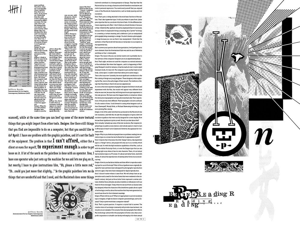
Productively, if at times confusingly, the concerns of professional and critical practice overlapped in Emigre, and this overlap was discernible in both the texts and in the design of the magazine. In fact, DiSalvo’s phrase ‘complex formatting’ could just as aptly be applied to the ever-changing look of Emigre itself. This look’s tendency towards customisation holds for #11 in which, as Andrew Blauvelt has noted, intertextuality and dialogue are realised and enabled typographically. In VanderLans’ design, each interview was assigned a different size and / or weight of Emigre faces Oblong and Matrix, and its own column width.56 Thus distinguishable, the interview texts, which tend to be multiple on any given page, parallel or intersect each other. As a typographic image of diversity, this design symbolises Emigre’s record as a publication that never seemed to have needed to consolidate an identity, but which allowed tensions between differing views to play out on its pages instead.
In 1993, VanderLans described the vitality of this exchange among ‘graphic designers, worldwide, who continue to regard Emigre as a meeting ground for new ideas. They send us samples of their professional work and personal experiments and they write letters, often challenging whatever we have taken for granted in graphic design. In turn, we challenge them (…).’57
recto designed by John Weber, 1989.
Source: Rudy Vanderlans
How to characterise the editorial temperament that accommodated this diversity? In his own contribution to an issue that brims with topical, polemical, and substantive arguments (#34), VanderLans referred to his inclusion of work from the Cranbrook Academy of Art years earlier:
I never felt an affinity for the theoretical underpinnings that informed some of the work coming out of Cranbrook. What I did recognize, though, was a common interest in the Macintosh, a curiosity to question typographic traditions and, more importantly, the need to create work that allowed room for the designer’s voice… Instead of buying into the fabricated singular narrative of modernism that would lead us all to an imagined better world, these designers were dealing with the world as it really was: fragmented, ironic, chaotic, humorous, ambiguous, and with room for many individual voices to be heard.58
Elsewhere, VanderLans called the results generated by ‘the new theories’ disappointing where design for print designs was concerned. However, he praised Ray Gun in terms that responded surprisingly to Robin Kinross’s social critique of deconstructed or otherwise expressive typography. VanderLans argued, ‘If “[t]he reproduction and distribution of text is part of the life-blood of social-critical dialogue,” as the critic Robin Kinross says, then Ray Gun must be considered quite successful,’ since it is ‘completely dissected by its readers.’59 The same could be said for Emigre, which was voraciously read both visually and verbally by fans and detractors alike.
As does the title of the piece in which they occur, ‘Radical Commodities,’ these comments reconciled seemingly contradictory positions. Similarly, experimentalism and functionalism were united, according to VanderLans, in the work of his partner:
At Emigre, Zuzana Licko started her career as a type designer working mostly on experimental fonts that directly addressed the limitations of low resolution computer screens and dot matrix printers. From the very start, these designs were undertaken to expand, improve or add something of use.60
As his delineation of the interest he took in the Cranbrook scene would suggest, two other terms might be linked to describe the design philosophy underpinning VanderLans’ publishing program: multicultural modernism.61 Accordingly, while VanderLans may have asserted and adjusted his own views on the role of typography as a bearer of textual and cultural meaning, his editorial choices and layouts wove together divergent strains of design criticism and a range of theoretical sources.62
As perspectives shifted from one piece to another within an issue, so technological changes brought new questions and concerns to the fore in Emigre from one issue to the next. In #40, The Info Perplex, guest editor Andrew Blauvelt proposed a framework for extending the project of critical design practice to interactive media.
Blauvelt’s essay critiqued functionalist discourse in information design and mechanistic communication theory. His embrace of the rhetorical possibilities of information design in time-based media combined concepts from postmodern architectural theory and post-structuralist ‘language game’ theory with cultural studies’ attention to the ‘social contexts in which communication (…) occurs’ and the ‘cultural identities’ of audiences to be engaged.
Blauvelt’s essay, while focused on the specific affordances of new information technologies, avoided the pitfalls of techno-determinism by keeping in mind, as Jay David Bolter and Richard Grusin prescribed, the social dynamics and economic dimensions of media. For Blauvelt, the compelling aspect of ‘multimedia’ is that it ‘has a potential to express the hybrid nature of information,’ which can be ‘rendered as the complex phenomenon it represents.’63
Blauvelt’s essay offered a technological update and a synthesis of much of the theory that fuelled debate in the pages and volumes separating it from Emigre #11. However, his reiteration of this theory’s critical imperative — to ‘use the tools and grammar of media against itself to reveal suppressed information, articulate alternative viewpoints, and engage spectators in a more active form of viewing’64 — found no resonance in VanderLans’ own use of the Web by this time (1996), nor in his evolving relationship with writing and its typographic (re)presentation. In his introduction to Emigre #39, VanderLans found fault with both sides of the typographic discussions his journal had sparked and carried: not only had the new theories ‘generated disappointing results’ in print, but the old theory had failed to adapt ‘to the new environments of electronic publishing.’ ‘[I]f legibility is a social concern,’ he asked, then why have ‘our most respected typographers’ largely neglected the problem of typographic excellence on screen? In this setting, he continued, ‘we see more use for the teachings of the young Jan Tschi-chold than the writings of, let’s say, Frances Butler.’ Faced with the technical difficulties and overload of current information technologies, he wrote, the simplicity advocated by Tschichold was ‘far more practical than the multi-level, interactive, hypertextual and audiovisual forms of communication’ promoted by critics like Butler.65
In his introduction to Emigre #48, VanderLans justified the plainness of Emigre’s commercial website in terms that followed Tschichold’s functionalist principle of clarity. In response to letters from designers who said the site ‘sucks’ and to the question, ‘Why has all this experimentation and excitement for new technology not continued in the design of our web site…?’
VanderLans defended the site as being ‘highly innovative,’ and contended that ‘many graphic designers fail to recognize this because they focus on surface features.’ Confronted with ‘a technology that enables information (…) to be delivered faster than lightning (…) what do graphic designers do? They dress it up with effects.’ The design of Emigre’s site combined ‘integrated information structures, simple interfaces and common sense (…),’ he argued, ‘it wasn’t meant to look cool; it was meant to work.’66
This introductory essay reprises a theme that recurred throughout Emigre’s run — that of ‘designers becoming initiators and producers.’67 Emigre, as a venture integrating publishing and commerce, was empowered by the Macintosh, wrote VanderLans, to produce ‘our own products: a magazine and a series of digital typefaces.’ Describing the magazine as an opportunity to display these faces and test their reception by fellow designers, VanderLans credited the Web as a democratising force of distribution.68 His insight into the entrepreneurial opportunities made available to designers by digital media is most remarkable for its immediacy.
This insight dates back to the inception of Emigre in 1984 and is reflected in Emigre #11’s introductory essay. In fact, Licko and VanderLans’ comments there seem to forecast the social prospects of the Web, including niche marketing and on-line communities. ‘By making publishing and dissemination of information faster and less expensive,’ they affirmed, ‘computer technology has made it feasible to reach a smaller audience more effectively.’69
Emigre’s provenance — the Bay Area in the mid-1980s — lends context to VanderLans’ later comment (Emigre #46) that he had always considered Emigre a fanzine, and situated the ethos from which his interest in zines arose. This ethos valued the ‘self-determination’ that comes from ‘control over the creation, manufacture, and distribution of creative products.’
In 1998, when this Fanzines and the Culture of DIY issue appeared, VanderLans noted the launch of academic programmes designed to educate the ‘designer as producer / entrepreneur,’ which, he wrote, ‘might be precursors of things to come, as graphic designers are starting to look beyond solving other people’s “problems”.’70 While the website that sold its fonts may not have been experimental, the overall Emigre enterprise, with its critical journal as specimen sheet, certainly was.
The community of designer / reader / critics engendered and sustained by this sheet was unique in its moment. The practical and conceptual ties linking this community, the question of writing’s relationship to design, and the journal’s typography will structure a final consideration here of Emigre’s significance in its time and its relevance to the issues facing typographic design today.
The distance that might separate VanderLans’ work as a designer / writer / publisher from the work Emigre published at any given time can be measured via a comment he made in his introduction to Emigre #39 regarding the Elliott Earls project that was reviewed favourably by FitzGerald in the same issue (see above). VanderLans wrote that, while he could appreciate the disparate character of text in Earls’ multimedia piece, ‘When reading an essay (…) I crave for knowing what the author means so that I can learn and respond and ask specific questions if necessary.’71 This traditional notion of meaning as intended and delivered by a text contrasts with that of meaning as produced by a reading for which the stage is set, whether critically or conventionally, by a text’s typography.72
VanderLans cited the theoretical and experimental cases made by Emigre’s contributors over the years for graphic intervention in a text’s delivery (and might have included some of his own layouts among these experiments), but concluded that ‘their applicability to the real world (…) has proved to be limited.’73
Limits were embraced by Emigre #39’s design, the typographic system of which is exceptionally simple, its elaboration being mainly confined to the use of red ink to highlight phrases within text blocks.74 Another notably pared-down layout can be found in Emigre #47, the introduction to which includes statements by VanderLans that conflicted explicitly with the advocacy of critical practice often attributed to the journal: ‘The worth of the articles, to me, resides entirely in their content (…) why should I try and interfere with that and present it differently for my audience?’
Again, the notion of textual content as preexisting typographic form and its engagement by a designer or reader sits somewhat awkwardly alongside the arguments of Emigre’s key writers, some of whom were mentioned by VanderLans as counterpoints to his perspective. ‘Jeffery Keedy, in Emigre #43, makes an appealing case for why designers should interfere,’ he writes. ‘Nonetheless, the layouts in Emigre have become simpler over the years.’75
Whereas his colleagues might have championed expressive typography on critical grounds, VanderLans disarmingly confessed that insecurity about the quality of his writing may have been the motivation for complicating his layouts: ‘[B]ut the more confident of my writing I became (…) the less I felt a need to deconstruct or add (…) visual meaning to a text. Instead, I let the text speak for itself.’
A footnote to this introduction provides yet another indication of the space made for differences in Emigre’s pages. While the previous year’s Mercantile Issue (#42) had featured Alan Marshall’s critical-historical analysis of the business interests underlying what he called the ‘Morison / Monotype doctrine,’ in #48 VanderLans cited Morison’s First Principles of Typography as a ‘milestone’. One of the most frequently mentioned precepts in this milestone is that ‘any disposition of printing material which (…) has the effect of coming between author and reader is wrong.’76 This dictum would seem to condemn many of the designs and vindications that comprised Emigre’s legacy.
Thus, VanderLans’ proximity to Morison’s standpoint might seem contradictory at first, but this affiliation appears more coherent if viewed in the light of the magazine’s commitment to such variance as the Morison reference itself represents here. That is, by whatever typographic means, VanderLans arguably always treated Emigre as a shared text, and Morison’s insistence on convention was founded, however problematically, on a valorisation of typography’s social utility.77
In Emigre’s sociably titled Do You Read Me? issue (#15), Zuzana Licko reasoned that qualities ascribed to typefaces are themselves socially based. Unpacking Morison’s rule that ‘type must be familiar,’ Licko summed up her analysis by saying that legibility is ‘a dynamic process, as readers’ habits are everchanging’ in an oft-cited formulation of her own: ‘You read best what you read most.’ Morison’s Times Roman, for example, is not, she contended, ‘intrinsically legible.’78 Instead, its habitual use has bred a familiarity that makes it so. By such arguments, Licko implicated type and typography in the social text of history. Design’s part in the composition of this social text was a subject of fundamental interest throughout Emigre’s run. Seen from this angle, another of Emigre’s favoured topics, that of design’s relationship to writing, assumes its full scope.
How does typography write? What social interests and cultural purposes are served by the typographic codes of textual presentation? This inquiry might appear self-involved in the hands, or fonts, of designers, but as overseen by VanderLans, it never fails to engage an audience — even if that audience is largely made up of peers. Thus, while the Mouthpiece issues (#35 and #36, guest-edited by Anne Burdick) assumed their positions in the legibility wars then waging among a relatively small group of practitioners and critics, the stakes of this battle were seen to lie well beyond this circle.
So, too, should designers transcend their discipline and its professional confines, wrote Gérard Mermoz in “On Typographic Reference (Part One)”. Mermoz concluded that what was needed was not necessarily more interpretive treatments by designers, but ‘more collaborations between authors and designers,’ for example, ‘to enrich the reading process by a recourse to the semantic resources of typography.’79
In this as in other instances, Emigre can be seen to stand for a critical awareness of agency leading to an expansion of engagement. Emigre #58, the Everyone is a Designer! Manifest for the Design Economy issue, which reprinted work edited by NL. Design, represented the range of this engagement. This issue’s bold colours, type and aphorisms mixed and mashed all sorts of stances with regard to the historical and technological situation in which graphic design found itself, often juxtaposing widely divergent views across a single spread.80
On the inside front cover, an unsigned text warns that ‘Along with its democratic potential, new media has also become inseparable from commerce. Money is designing the world.’81 Opposite this text, three vertically set, all-caps words read: ‘Reclaim public space.’
Thus, at a time (in the wake of the dot.com crash) of reflection on the commercialisation of the Web, Emigre welcomed a host of prompts to look beyond the roles in which designers and typography were being cast by these commercial forces — even as Emigre itself continued to operate as a hybrid critical and commercial venture, placing its catalogue at the centre of the journal and conducting a marketing survey inside the jacket it had added to the cover.82
Meanwhile, on one of the magazine’s shared pages, Max Kisman asked whether designers would rebel against ‘[i]nterface stupidity (…) and push forward with a new visual language of aesthetic functionality, embedded in a broader set of social, cultural and political a-priori?’83 This call for sophisticated proaction in the face of new media’s incipient economic structure revives the impulse that VanderLans exemplified in seizing the technical, cultural and social capacities of the first desktop tools. sources of typography.’79
Since 2001, when that call for sophistication in interface design was published, the emerging discipline of interaction design has staked out a field that it proposes to be distinct from graphic design — founded not on formal principles, but on user-centred and collaborative processes. While usability may have been seen as a problematic concept by many of the designers whose reactions mark the pages of Emigre #58, this quality figures centrally in a section of the next issue in which VanderLans updated the history of Emigre Fonts.
“A Synthesis of Bitmap Fonts” begins ‘More than fifteen years ago, Zuzana Licko designed a series of coarse bitmap fonts, created on the newly introduced Macintosh computer with crude public domain software.’ Seen as idiosyncratic, he wrote, these faces were initially dismissed as soon to be rendered obsolete by higher display and output resolutions.
‘Recently, however, coarse bitmapped fonts have made a huge comeback,’ VanderLans remarked, as a result of their utility on the screens of cell phones, pagers, kitchen appliances, and so on. A bitmap font, he explained, is ‘designed to be optimized for a specific resolution,’ and it is this fine-tuning to technical standards that makes a bitmap face so apt. Since, ‘screen display has become the final method of viewing much of our information’ and ‘computers are increasingly affecting (…) [our relation to] everything around us,’ the ‘bitmapped aesthetic is here to stay,’ he concluded.84
Our immersion in networked media has implications for typography beyond the display of information. In 2011, Andrew Blauvelt and Ellen Lupton noted that, in grasping ‘the tools of creative production (…) [r]ecent design has taken a pragmatic turn, emphasizing process, situation, and social interaction over a fixed and final outcome.’ Given ‘the increasingly open nature of design practice and the open access to tools,’ they wrote, ‘co-authorship, reference, and collectivity’ take the place of a previous investment in authorship.85
It is this very experience of unfinished collective process that one has when perusing Emigre’s issues, which overflow with unresolved differences, open-ended questions and test-run formats. While Blauvelt assigned the emergence of the designer as an ‘orchestrator of frameworks’ to what he called the age of postproduction, a version of this meta- role already belonged to the designer as publisher — or at least to VanderLans, who chose to let his readers write and writers guest-edit rather than to steer a discussion or to decide its outcome.86
The old schism between design and production was ‘outmoded’, according to Blauvelt, partly ‘because it considers only the actions and possible roles of its own official agents (designers) instead of the complex and fluid social relationships and networks in which they are entwined with other players.’ While Emigre’s roving eye attended to these relationships, the community of its user-producers, the crowd that surrounded its pages, were almost all specialists-designers and even designers’ designers. Nonetheless, among this crowd, a culture was fostered that could serve as a model for today’s socialised design and design-enabled networks.
Blauvelt both celebrated and criticised the Internet’s sharing culture, which had replaced the scepticism of his generation with a ‘newfound optimism’. Bringing his ‘90s-era’ criticality to bear on this situation, he observed that most of the graphic design shared on-line ‘circulates in a free-floating, contextless, post-critical space.’87 This ‘vacuum’ contrasted sharply with the critical saturation of Emigre’s pages, which dripped analyses and arguments into the studios of its subscribers and the conversations of its readers. Emigre’s exploratory use of new technologies and tentative appropriation of theoretical models may have been historically specific, but its result — a mass of questions raised both verbally and visually by implicated practitioners — holds together as an example for thoughtful practice today.
As a collection of snapshots of designers unpacking their new digital equipment, Emigre #11 revealed the significance of production to the identity of graphic design and to the orientation of its practice. Software’s incorporation of production settings, which now underlie routine modes and protocols of typographic practice, can be seen in its initial, disruptive phase to place a mirror before designers, prompting them to take a fresh look at a defining relationship.
As a cursor that reinserts us into the historical context of this reckoning, Emigre #11 reminds us of the legacy of early modernist views of this relationship — between design and production, aesthetics and technology — and the carry-over of these views’ social frame into postmodern dispositions. Thus, a priority placed on formal integration and structural exposition commingled on Emigre #11’s pages with an interest in new resources for individual freedom of stylistic expression. If only as a reminder that eras in the history of ideas do not fit cleanly into separate and successive segments, this layered moment is worth entering.
Finally, as a point of departure for considering the journal’s relevance to contemporary practice, #11 exemplifies Emigre’s overall project of transdisciplinary expansion through proactive annexation of the platforms afforded by digital and networked media. Paired with a broad critical interest in graphic design’s cultural agency, this inclination towards content generation, distributed authorship, publication and commerce produced a rich record of experimentation and reflection.
This record remains a reference for anyone interested in gaining critical traction or clearing speculative space amid the rushes of market-driven, technology-contingent practice.
Emily McVarish is Associate Professor of Graphic Design at California College of the Arts, where she teaches typography, writing, and design history. A writer, desig-ner, and book artist, she has maintained a hybrid practice in San Francisco since 1990. Her work has been exhibited internationally, published by Granary Books, and collected by Harvard University and the British Library, among other major libraries and museums. In collaboration with Johanna Drucker, she co-authored Graphic Design History: A Critical Guide (2013) published by Prentice Hall. Her critical writing has been featured in Visible Language and Design and Culture.
There are no comments