

Arts et métiers graphiques and the French typographer as an artist and craftsman
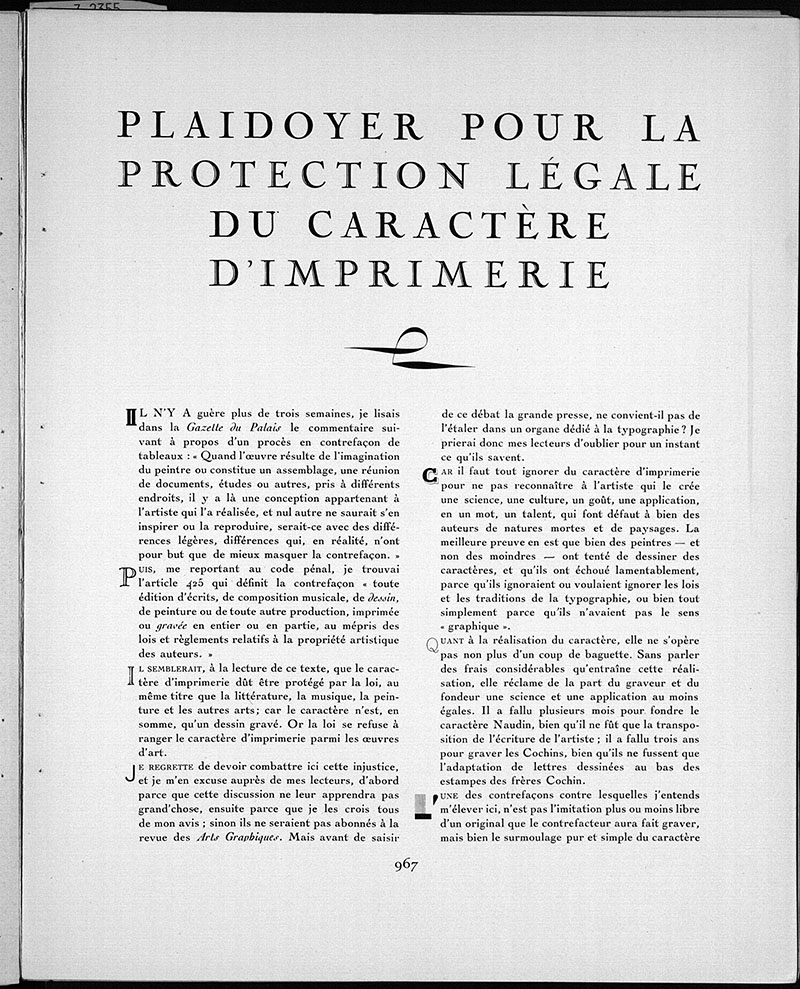
In the seventeenth issue of the French interwar design magazine Arts et métiers graphiques (Graphic Arts and Crafts, 1927-1939, hereafter AMG), Charles Peignot — artistic director of the Deberny et Peignot type foundry and owner of the periodical — published an article pleading in favour of the legal protection of typefaces. For Peignot, it should be illegal to imitate a typeface, just as it was prohibited to copy any other form of art without permission. To him, creating a typeface was an art similar to engraving or drawing.1 This plea for copy-rights granted the typographer a status comparable to that of a literary author, whose work had already been legally protected in France since the late eighteenth century. The designer also had to be recognised as the creator of his or her own work and had to remain its owner. Furthermore, Peignot likened the typographer’s work to that of other visual artists. His plea and statements are very much in line with the concept of the typographer that was presented in the magazine. However, what was this concept? In what way did the magazine’s treatment of designers differ from that promoted by the New Typography of the Central European avant-garde, perhaps the most important innovators in design in that period? Firstly, we know that New Typography was not particularly welcomed in France, which found itself at its margins.2 Furthermore, do these differences point to a typically French view of typography and the graphic artist? Before attempting to answer these questions, I will first briefly portray the field of typography in the first decades of the twentieth century and provide some notes on the history and programme of Arts et métiers graphiques.
In his 1928 The New Typography: A Handbook for Modern Design, Jan Tschichold observed that ‘[m]odern man has to absorb everyday a mass of printed matter which, whether he wants it or not, is delivered through his letter-box or confronts him everywhere out of doors.’3 This aptly characterises the state of typography in the first decades of the twentieth century. New techniques allowed for ever-increasing numbers of (illustrated) newspapers, leaflets, posters, and books to be produced faster, cheaper and in bigger quantities, which meant that an increasing group of readers could engage with a continuously growing mass of printed matter. Cheap paperbacks were sold widely all across Europe and brought (popular) literature to a large, non-upper-class readership. In 1906, for instance, the Englishman J.M. Dent started publishing quality editions of classics at the lowest price possible with his ‘Everyman’s Library,’ that did in fact appeal to every reader.4 Periodical publications, in turn, were more suited than was the book, a keeper of eternal values caught between its covers, to attest to an ever-changing world, as Michel Melot stated.5 In fact, periodicals’ publication rhythm was faster, their print runs were higher, and their production costs were lower. This made the magazine the preferred means of communication for subversive movements such as the historical avant-garde.6 Finally, new printing techniques also led to the flourishing of advertising design. Poorly designed, non-illustrated announcements pasted on walls, or a few lines of text printed in newspapers, made room for colourful posters and advertisements, leaflets and catalogues. Typography was everywhere.
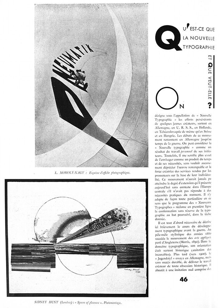
Typographers from all across Europe reflected on the various technological innovations and the rise of mass publication at the turn of the twentieth century through periodicals or books. Calling for either a return to classical styles or a radically new understanding of design, they formed societies of like-minded designers, and taught pupils their design principles in institutions such as the Bauhaus school. The multitude of printed matter confronting everyone, often a mix of every conceivable style, prompted Tschichold to compose his aforementioned handbook for modern design. He promoted a functional form of typography that was devoid of all artistry and unnecessary ornamentation, which would allow readers to access information more easily and quickly. His book, full of concrete examples and guidelines for typographers, was a synthesis of numerous earlier writings. László Moholy-Nagy had written an essay entitled “Die neue Typographie” in the catalogue for the 1923 Bauhaus exhibition and El Lissitzky had published “Topographie der Typographie” in the German Dada magazine Merz (published by Kurt Schwitters).7 Tschichold himself had already written a short, manifesto-like article on New Typography in Kulturschau and edited a special issue of the magazine Typographische Mitteilungen entitled Elementare Typographie.8
However, new design aesthetics did not remain confined to schools, the ‘little magazines’ of the avant-garde or trade periodicals, but also found their way into more popular magazines of the period. The German fashion magazine die neue linie helped disseminate the aesthetics of New Typography to the mass market.9 Vanity Fair, an American ‘smart magazine’ that dealt with news, fashion and the arts, not only drew on avant-garde typography (among a multitude of other styles), but also contained writings and artwork by avant-garde artists, who were often treated as celebrities. In this way, its (upper-)middle-class readership became acquainted with these innovations.10 In 1934, Russian-born designer and photographer Alexey Brodovitch became the art director of the American fashion magazine Harper’s Bazaar. In this case, innovation came from a popular magazine itself, as James Crump indicated:
Through his work at Harper’s, Brodovitch revolutionized modern magazine design by forging a greater integration of typography, text and photography. His innovative layouts and numerous cover illustrations for the magazine popularized the techniques of montage, full-bleed paging and strategic sequencing of photographs that fostered interactive readership.11
Popular magazines such as these brought new concepts of design to a wider audience, which made it more likely that they would be accepted.
It is in this context that Arts et métiers graphiques, a graphic arts periodical published in Paris between 1927 and 1939, came into being. The magazine was created by a society founded by five key figures from the French printing and publishing industry, who were brought together by Charles Peignot, artistic director of the Deberny et Peignot foundry. He may have done so at the insistence of Lucien Vogel.12 Vogel was an experienced publisher of illustrated periodicals such as the Gazette du bon ton and Le jardin des modes and he would go on to publish the famous photographically illustrated news weekly Vu (1928-1940) up to 1936.13 The other society members were H.L. Motti, owner of the Vaugirard printing office, where the most of the AMG publications were printed; Léon Pichon, a printer, typographer and publisher, and Walter Seymour Maas, who was head of the advertising agency Dorland. The magazine’s consecutive general editors were Marcel Astruc (issues 2-3), François Haab (issues 4-41), and André Lejard (issues 42-68). Publisher and typographer Henri Jonquières was credited with being the layout designer ‘maquettiste’ from issue 45 (1935) onwards. Among the frequent contributors one finds Maximilien Vox. This was the pseudonym of Samuel Monod, an important French typographer famous for designing covers for Grasset and creating the logo with the mask and the pen for the collection of detective novels Le masque, as well as for introducing the Vox-ATypI typeface classification system. In addition, famous authors such as Paul Valéry, Philippe Soupault, André Beucler, Pierre Mac Orlan, Jean Cocteau and Raymond Queneau, art critics such as Maurice Raynal and Claude Roger-Marx, and designers, including Jean Carlu, Cassandre, Tschichold, and Alexey Brodovitch, provided written and visual content.
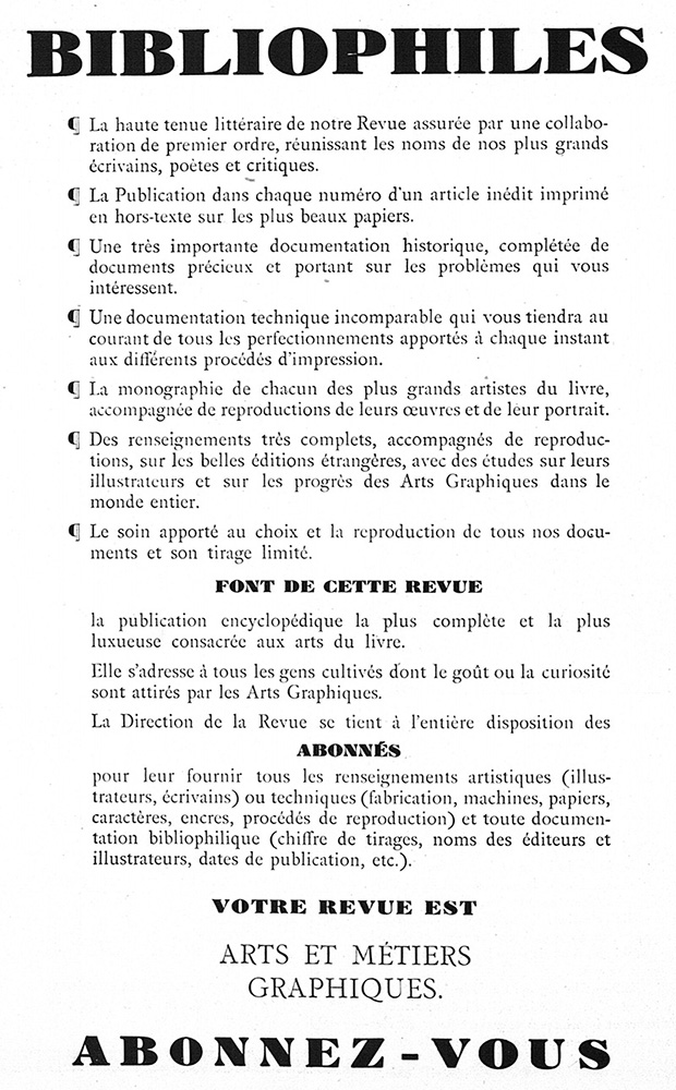
AMG had to be an encyclopaedia of typography. According to a “Programme” published before the release of the first issue, the magazine aspired to act as an intermediary between artists, artisans and professionals from the typographic industry on one hand and a more general readership interested in the graphic arts on the other.14 An advertising leaflet included with the first issue explicitly addressed bibliophiles — the word was printed in large, bold type at the top of the page. It stated that the magazine was to inform its readers about all aspects of the printing industry: typography in all its forms, new and old printing techniques, the art of the book, and similar subjects. It would do so through historical and technical articles written by both leading art critics and literary authors of the period. According to the editors, these contributors would ensure the magazine’s literary quality, which they even listed as the first ‘selling proposition’ on the leaflet.
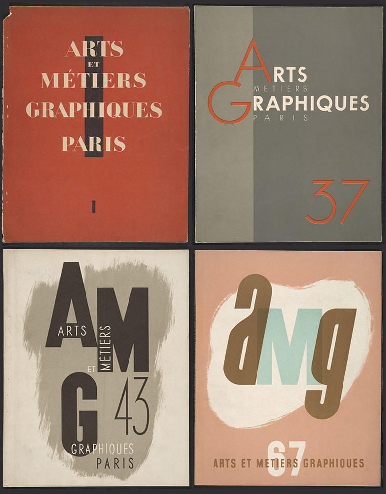
AMG 1 (September 1927), AMG 37 (September 1933),
AMG 43 (October 1934), AMG 67 (March 1939).
In addition, the leaflet announced that AMG was to be a luxurious publication of the highest material quality. The editors wanted it to be a monument to modern French typography. Measuring 31 × 24.5 cm and usually about 80 pages in length, it was printed on different types of special paper (the majority of the magazine consisted of coated paper). Its designers made use of multiple typefaces and various figurative layouts, and the articles were copiously illustrated — including photographs and colour images — by means of the newest printing techniques. A special place was reserved for the typefaces sold by Deberny et Peignot, such as Bifur (1928) and Peignot (1937), both designed by Cassandre.15 In a similar vein, particular attention was paid to photographs produced by the Deberny et Peignot advertising studio, as well as the typographic services of other companies that were related to the magazine. In fact, for the companies involved in its creation, AMG was a place to showcase their products and printing techniques, particularly the most advanced ones. Each issue also contained numerous offset inserts with additional illustrations or demonstrations of new printing techniques, excerpts from bibliophile books, reproductions of advertisements and so on. Again, many of these images were provided by companies related to the magazine. All the firms involved in the creation of the magazine and the materials used were listed in an elaborate colophon placed in a prominent position at the beginning of every issue — not at the end, as was custom in France in that period — to ensure that the readers’ attention was focused immediately on the material quality of AMG.
Through this high attention to both content and form, the editors sought to please their readership, consisting of graphic designers, industry professionals, advertising agents, and bibliophiles, as well as people of letters in general.16 Most of these readers subscribed to the magazine.17 The magazine itself did not mention its print run, but Charles Peignot spoke of three thousand copies in a 1930 letter addressed to his sister, the writer Colette Peignot.18 Critics confirmed this number, indicating that around three to four thousand copies of each issue were printed.19 A single issue initially cost thirty francs in France and Belgium and forty francs for readers abroad. However, increasing production costs (probably connected to the electoral victory of the left-wing Front Populaire, which demanded higher wages for labourers, including printers) led the editors to increase the price to thirty-five francs and forty-five francs for international readers from issue 55 / 1936 onwards. At the same time, the magazine was no longer published six times a year but only five times. From issue 60 / 1937 onwards, the price per issue increased a second time to forty-five francs and to fifty-five francs for readers abroad. For subscribers, the price per issue was lower, with subscriptions initially costing one hundred and fifty francs per year, but eventually costing two hundred francs in November 1937. Subscription fees for international readers, meanwhile, varied from two hundred to two hundred and forty francs.
As the prices for readers from abroad suggest, AMG was an internationally-oriented publication from the beginning. Some issues contained English captions underneath the images, English summaries of the articles, or even complete translations as a service to non-French readers. It is said that up to a third of the magazine’s subscribers were from abroad — from all over Europe and from the United States.20 In addition, the editors had particularly good relations with the German trade periodical Gebrauchsgraphik and its chief editor H.K. Frenzel. This magazine was founded in 1924 and discussed typography, the book, advertising and packaging, focusing both on traditional and on modern design.21 If it was not a model for AMG, the publications were at least strikingly similar, both in their content and their pluralism. Some issues of AMG contained translated articles taken from Gebrauchsgraphik or letters from Frenzel, while advertisements for the magazine frequently appeared in “Notes & Échos” at the end of every issue. This section also contained adverts for a variety of national and international magazines, not only trade magazines, but also cultural periodicals and popular scientific journals. It also featured reviews of magazines from all over the world. Regular articles regularly focused on international artists, book publishers, or the state of typography in a certain country. Issue 26 / 1931 was even completely dedicated to the “International Art Book”.
Despite these international tendencies, AMG also had an objective to promote nationalism. In fact, the luxurious material form of AMG mentioned above did not just serve to appeal to an audience appreciating well-crafted printed matter. The magazine as a whole exemplified what modern quality printing had to look like, in an attempt to reinvigorate French typography — something that the magazine also tried to do through articles on new techniques.22 Design historians have indicated that French graphic design in that period lacked the innovative impetus of German and Eastern European avant-garde typography, for instance.23 France did not have a Bauhaus, nor a modern typeface that could really compete with the internationally successful sans serifs championed by New Typography. Instead, French typographers, at unease with these innovations, chose to follow their own path and generally stuck to a well-established national tradition, or chose to ‘[reinvent] the design tradition’ instead of revolutionising it. Even Cassandre and Jean Carlu, probably the most famous and innovative French poster designers of that period, continued to draw and avoided the typo-photo propagated by New Typography.24 Charles Peignot and the creators of AMG did want to create a modern and properly French typography that they hoped could compete with the Central European innovations. In a move that might be typical of French ‘tempered’ modernism in a period of retour à l’ordre,25 they searched across the borders for innovations, all the while steering clear of the excesses of the avant-garde and trying to preserve the worthwhile elements of the (national) printing tradition.26
The periodical had to be a pioneer in this project. It wanted to inform designers about technical and aesthetic innovations (héliogravure, offset printing, new techniques in photography, modern typefaces, the work of contemporary designers and so on). At the same time, it wanted to show the merits of classic French publishers, printers and type designers such as the Renaissance printer Simon de Colines or the Didot family.27 The pages of the magazine, both content-wise and visually, reflected this pluralist aspiration to reconcile the modern and the classic, and demonstrated how new techniques and high quality materials could be put to good use. For the editors, the beauty of printed matter and the ‘signature’ or the hallmark of the style of the individual graphic artist continued to play a role.28 Here, the AMG approach differed from the functionalist New Typography that preferred anonymous and collective design — nonetheless, while Tschichold stated that a typeface was best created by a group of people, including an engineer, many creations of the New Typography were actually explicitly attributed to an individual designer.29 But how, exactly, did AMG treat and conceive of the typographer?
One of the purposes of AMG was to function as an encyclopaedia on everything related to the graphic arts. The editors wanted to bring (at least some aspects of) specialist knowledge of design and printing techniques to a more general public through richly illustrated articles written in an accessible way by experts. However, AMG also wanted to contribute to the education of aspiring designers and to defend their practice. In fact, as will be addressed below, the editors believed that typography was a craft that could be learned and that required dedication. It was not only an art requiring creative genius. In this way, the technical and historical articles also served as useful background information for the designer. Furthermore, the magazine was full of inspiring imagery: the editors used it as an anthology of creations that they thought worth following and which served as examples of best practices in typography.

in AMG 15 (January 1930).
In this respect, it seems that AMG was particularly interested in advertising design. Advertising posters flourished at that time in France, where they had always occupied an important position.30 Internationally acknowledged at that time were les quatre C (‘the four Cs’): Cassandre, Jean Carlu, Paul Colin and Charles Loupot, who led the way towards a renewal of poster design via art deco creations.31 The magazine’s interest in advertising was clear from the first issue, which contained an essay on the subconscious and advertising, and an article on the catalogue d’art, the luxurious catalogue. Moreover, in a feature entitled “L’actualité graphique,” which was included in every issue starting from the fourth, all types of advertising design were put on display. The editors, who received no financial recompense for including the advertisements, aspired to create an ‘exhibition’ of advertising to provide a complete overview of the advances in French typography: ‘les plus beaux catalogues, les en-tête de lettres, les cartes d’invitations, les menus, les affiches y seront reproduits sans commentaire comme sont présentées dans un salon de peinture les toiles qu’a retenues le jury.’ 32 In fact, the section was full of images and reproductions of posters and leaflets the editors considered worthwhile, although they never wrote anything about their selection criteria. The feature also paid attention to new techniques such as illuminated advertising. Furthermore, this museum of advertising served as an important source of inspiration for young, aspiring designers — a welcome addition to their training. As Katrien Van Haute rightly pointed out, their education did not have to rely only on theoretical articles, but also, and perhaps even more, on examples worth following.33 It is important to note that these collections of ‘best practices’ differed from those presented by Tschichold in that they were much more pluralist and less categorical than were those included in The New Typo-
graphy, with its strict distinction between ‘good’ and ‘bad’ examples. Colourful hand-drawn art deco posters and booklets appear next to designs that consist of nothing but letters, and photographic advertisements including typo-photo creations by Piet Zwart or Tschichold himself, without the editors preferring one to the other.
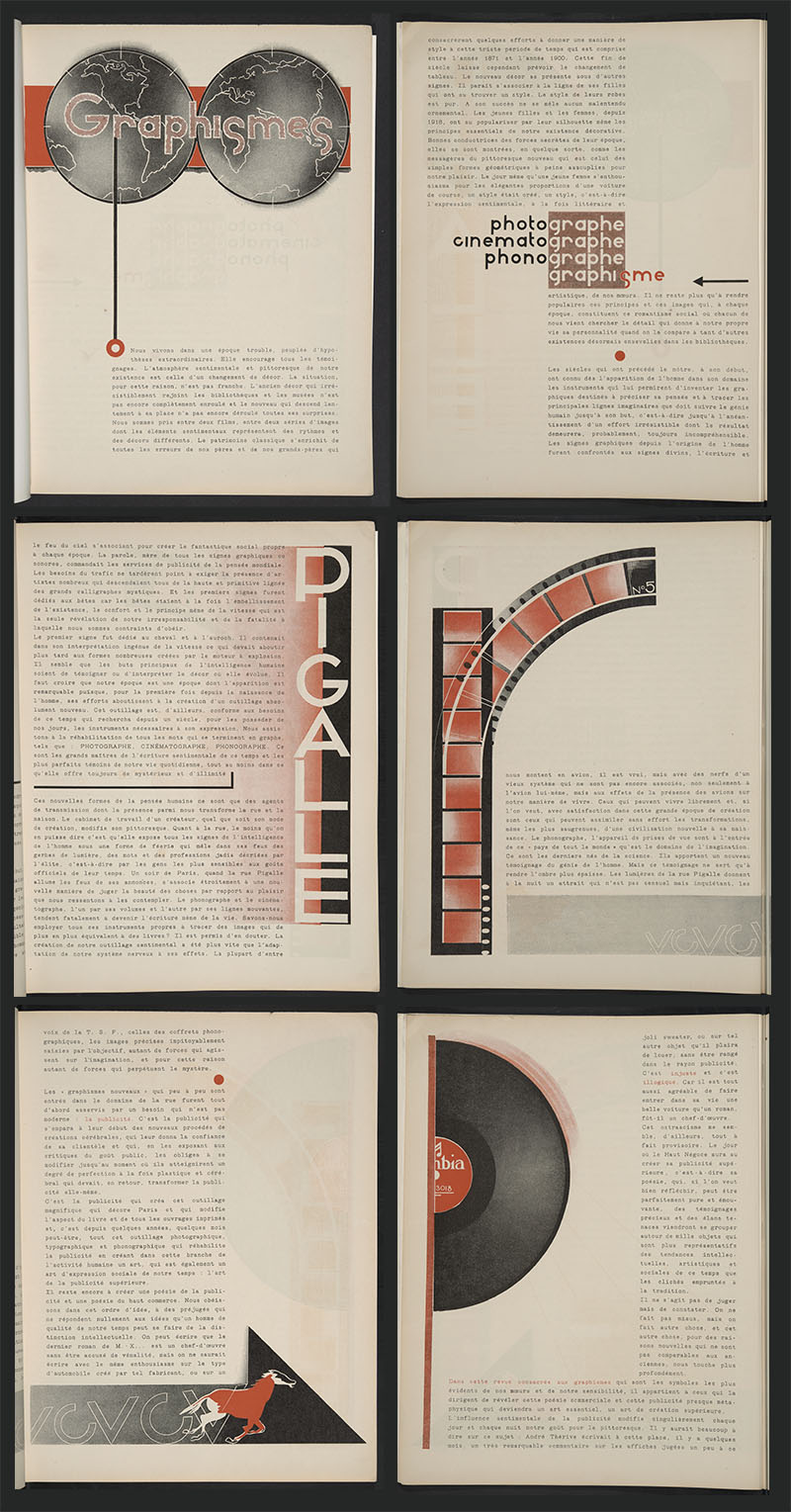
On one hand, for AMG, advertising was an art. In the article on the catalogue d’art, Jean Luc reflected on the condescending attitude of some bibliophiles towards printed matter with an advertising function. The author considered the catalogue a utilitarian work of art, and its creator an artist. Whomever disliked it because of its utilitarian nature was wrong, according to him, as utilitarianism had nothing to do with ugliness.34 A similar opinion regarding advertisements would be echoed in numerous articles by other editors. In an essay entitled “Graphismes”, which was an ode to new forms of ‘graphic expression’, Pierre Mac Orlan, at that time an extremely popular author, wrote that advertising was a form of poetry. For him, the poster had its origins in prehistoric mural drawings, just as did the fine arts. Thus, as cognates, the two forms were at least equal.35 André Beucler also linked advertising and poetry, while Louis Cheronnet compared Cassandre to the fam-ous author Paul Valéry.36 Previously, Cheronnet had observed that religious art was advertising for faith and the ‘divine concept’.37 As had Mac Orlan, Cheronnet tried to legitimise advertising by including it in the tradition of the fine arts or poetry. In “Salut à la publicité” (“A Salute to Advertising”), Léon-Paul Fargue related a nightmarish vision of a Paris in which all advertising had disappeared: ‘On était assoiffé de poésie. Le lyrisme contemporain était mort.’38 The sculptress Yvonne Serruys made no distinction between the artistic and the commercial work of photographer Edward Steichen, and stated that the applied arts were actually less applied and more free and true than were the fine arts.39
On the other hand, AMG did not fail to point out that advertising design was also a craft, a métier requiring technical skill. In fact, in an article on Brodovitch, Philippe Soupault praised the former’s craftsmanship rather than his creative genius. He lauded the designer for having realised that a typographer did not really need inspiration or fantasy, in the way that a painter did, but commitment and perseverance to resolve technical issues.40 Maximilien Vox, in turn, argued that advertising was an art and a métier with its own prerequisites. This meant that fine artists were not necessarily good poster designers, as they did not always know these rules of the ‘graphic game’.41 Ultimately, for the periodical, typography was an art and a craft in its own right, at least as valuable as the fine arts. Given patience, commitment and training, anyone, not just creative geniuses, could become a designer and, ideally, develop an individual style.
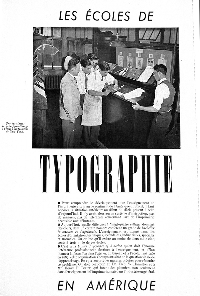
However, the rules of the design game did not come out of nowhere, unlike fantasy and genius. Typography could be learned in the same way as any other trade, and AMG wanted to contribute to this educational process. The designer could learn his or her craft as a painter (although a painter’s skills could not immediately be transposed to design, as Vox pointed out) or from another typographer. However, s/he could also do so in graphic design schools, on which AMG did report a number of times. René Zuber wrote an article on the Leipzig Academy for graphic arts and crafts, Louis Cheronnet described a summer course for aspiring designers and Chester Lyle discussed graphic design education in the United States.42 Furthermore, issue 35 contained a note on a course on advertising design in the French national school for the fine arts, taught by Cassandre. The note stated that a good commercial designer needed not only a certain gift, good taste and psychological insight, but most of all technical knowledge. The author suggested that the latter, which was lacking in many fine artists who ventured into advertising, could be acquired through schooling. Finally, the note deplored the lack of specialised courses in advertising design in France in comparison to Germany: ‘Quand donc la publicité graphique sera-t-elle, chez nous, comme elle l’est en Allemagne, l’objet d’un enseignement spécial, d’un entraînement bien réglé?’ 43 More and better schools, then, would allow for more aspiring designers to become trained typographers producing decent designs. These creations could offset bad designs produced by fine artists who were unaware of the specifics of the trade.
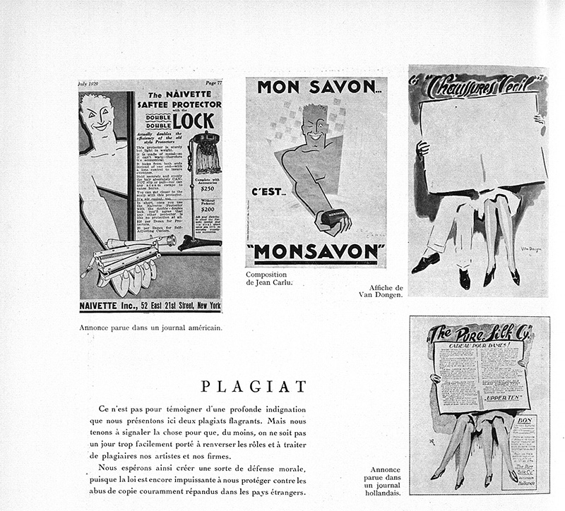
The magazine also looked after the interests of typographers. As has been addressed above, the periodical did so by legitimising and defending their practice as an art and métier in its own right, different from the fine arts, but equally valuable. In addition, AMG opposed copying or imitating creations by designers, advocating copyrights instead, which would benefit their trade. G. Pinget, head of a trade union for designers and publishers, strongly denounced an American publication with a cover that was an imitation of an AMG cover. He called for printers and publishers to condemn such violations of their ‘artistic property’.44 In a later issue, the editors again pointed to what they believed was a case of ‘plagiarism’, this time in advertising design. As international copyright laws were still lacking, the editors wanted to create at least a ‘moral defence’ against imitations.45
AMG 3 (February 1928).
However, the most overt plea for copyrights came from Charles Peignot.46 Peignot, the owner of a type foundry, believed it ought to be illegal to imitate a typeface, just as it was illegal to copy any other form of art. In fact, type-creation was an art to Peignot. He referred particularly to foundries making direct mouldings of recent, original creations, such as Cassandre’s Bifur. According to him, such types could not be copied by another company, not even when the latter modified the letters. On the other hand, Peignot was more lenient with regard to older, classical typefaces such as Garamond. These typefaces could be recreated and sold by all foundries alike, albeit that an adapted, reworked version of such a typeface could not be copied one-on-one by another firm. Over the years, Peignot would continue his struggle for copyrights. In 1957 he founded the Association Typographique Internationale (ATypI), which exists to this day, and whose stance on the legal protection of type is still largely the same as that of AMG. ATypI members agree not to imitate or adapt other members’ typefaces unless they have permission to do so. However, after fifteen years, types may be copied freely, with the condition that they are to be sold under different, unrelated names, and only when no other copyrights are at stake. Typefaces in the public domain may be copied and adapted. However, in the case of substantial adaptation, the type should be treated as a new one, which is again not to be imitated.47 For Peignot and the ATypI, then, a typeface was (and still is) the intellectual property of an artist and/or a company; it is not something that can be copied and reused by anyone.
This plea for the legal (and moral) protection of typography shows that the periodical sought to improve the status, the craft and the working conditions of designers. It asked for a protective legal framework that would also make consumers of typographers’ creations respect their work. Since the end of the eighteenth century, works of literary authors have been legally protected in France. Copy-rights guaranteed the author’s exclusive ownership of his or her oeuvre, forbade all imitations, and ensured remuneration in the event of reproduction of his or her work. It was a means of professionalising authorship and making writers less dependent on patrons or booksellers, who in earlier times used to buy a manuscript and thus acquired (the ‘rights’ to) the work, and could reproduce and imitate it freely.48 According to AMG, as did the literary author, the designer had to remain the owner of his or her work and had to receive due credit. S/he was not just an employee or an anonymous creator of intellectual property for companies that could (re)use it as they pleased. The copyrighting of typographic creations would ensure not only the designer’s legal protection against imitation, but also his or her independence with regard to companies, and guaranteed remuneration. As such, typographers became self-determined entrepreneurs who would get paid for their work.
Moreover, for Alain Berenbaum, French copyrights ‘celebrate the talent of a creator’ and constitute ‘a defensive system destined to divinise the creator.’49 Peignot’s plea for copyrights may have been a similar celebration of the talent, as well as the hard work and the style of the designer. It was perhaps also a way to ‘divinise’ him or her. In any case, Peignot granted the designer the status of an author. Furthermore, this request for the legal protection of the fruit of the work of the designer can be considered an important aspect of the magazine’s conception of the typographer as both artist and craftsperson. It confirmed the status of the typographer as an autonomous creator, as can be seen in articles celebrating graphic artists such as Cassandre, Jean Carlu, and Brodovitch, or an illustrator such as Alexandre Alexeïeff. Ultimately, all the points discussed above show that, for AMG, the signature of the typographer mattered and continued to do so: it was even worthy of preservation through legal protection.
Many important figures in the French design and printing industry of the early twentieth century collaborated on AMG. Thus, one may consider AMG’s views on typography and the designer characteristic of a French, tempered modernist concept of the practice. This view was opposed to the more radically avant-gardist views of the New Typography, which favoured modern, functionalist design. AMG’s French concept was one that wanted to reconcile some apparent oppositions. Firstly, it required design to be both aesthetically and technically modern. However, it was important to steer clear of extreme avant-gardist design. In AMG’s view, modern typography also had to respect the worthwhile aspects of the (national) tradition — an ideal that the magazine’s pages constantly reflected. Secondly, as the magazine’s title indicated, typography was both an art and a craft. Consequently, the designer was seen an artist as well as a trained craftsperson who was sufficiently dedicated to face the challenges posed by the design practice. In promoting this concept, the magazine also challenged the distinction between the fine arts and applied arts, defending the cultural legitimacy of the latter.50 In addition, AMG pleaded for the legal protection of the designer’s creations through copyrights. These would not only confirm the typographer as the sole owner of his or her work, protect her against imitations and guarantee remuneration, but also assure his or her autonomy. Moreover, copyrights granted the designer the status of an author and celebrated his or her work. All this indicates that, for AMG, the modern designer was an autonomous creator with a signature, possessing an individual style that continued to matter, and that was worthy of protection through legal means. It would be interesting to compare the views on design as presented in AMG with those in other contemporary French publications on the graphic arts to further refine our understanding of French design in the interwar period, a domain still relatively under-studied in comparison to other (inter)national typographic traditions, certainly those outside of the Francophone world.
Kristof van Gansen is a PhD Candidate working at KU Leuven (Faculty of Arts, Department of Literary Studies). He is preparing his dissertation on the French graphic arts periodical Arts et métiers graphiques, under the supervision of Jan Baetens. Van Gansen’s research project is funded through MDRN, a KU Leuven-based research group that studies European modernist literature (1900-1950) from a functionalist perspective. He is also connected to LITTéPUB, a French ANR-funded project studying the interactions between advertising and literature from 1830 to today. In Fall and Winter 2015-16, Van Gansen was curator of an exhibition on Arts et métiers graphiques and interwar design that took place in the University sLibrary of Leuven. For this occasion, he also edited a book on the periodical, published at Peeters.
There are no comments