
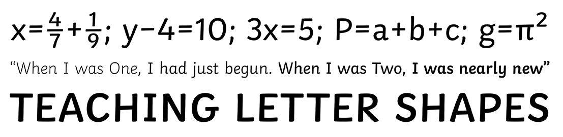
Contemporary educational and reading books are interesting material to study typefaces for beginner readers. Most of them are set in large sans serif typefaces and, within the Dutch-speaking areas, often in Helvetica or Arial and, to a lesser extent, the Gill Sans or another typeface.1 Unfortunately, there is almost no consensus in the existing literature regarding typefaces that are best for beginner readers. To date, discussions about typefaces for children and the legibility thereof remain inconclusive. Designers, educationalists and legibility researchers have contrasting views about the (proper) use of children’s typefaces, and educationalists’ views are often based on prejudices and on the force of habit. Designers tend to follow the views of their potential clients, and legibility researchers often lack a professional approach to layout in their experiments. Based on typographic approach a review of these contrasting views, this article argues that design research, and particularly the collaboration between the type designer and the scientific legibility researcher, is crucial. Such a new collaborative approach in typographic design research might allow not only for a deeper understanding and explanation of which typefaces are best for beginner readers, but also for the development and design of new, concrete and functional typefaces and guidelines.

Historically, the assumptions of educationalists and teachers have been based on intuition, practical use and tradition. Type designers tend to follow these established practices to ensure sales. As a result, most choices of appropriate typefaces for beginner readers remain hypothetical because they are not based on any fundamental scientific research.
Teachers tend to have strong views about typefaces for children’s books.2 According to them, typefaces in children’s educational and reading books for primary education should be set in large corpses because of their clarity. In addition, they tend to prioritise sans serif typefaces, as these are believed to be simpler looking than are serif typefaces, but even more so because sans serifs originally introduced the use of ‘infant characters’, letterforms that are believed to be easier for children to read due to their formal similarities to written characters.3 These views are based on tradition and on the force of habit.
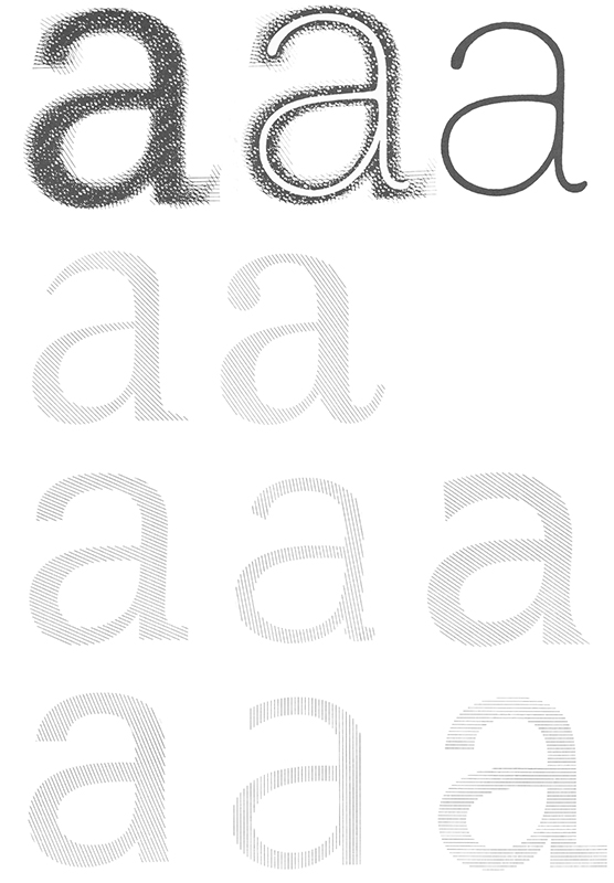
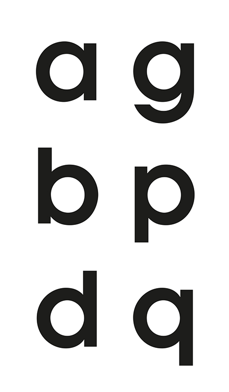
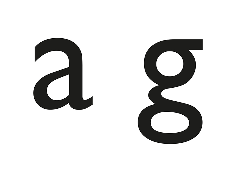
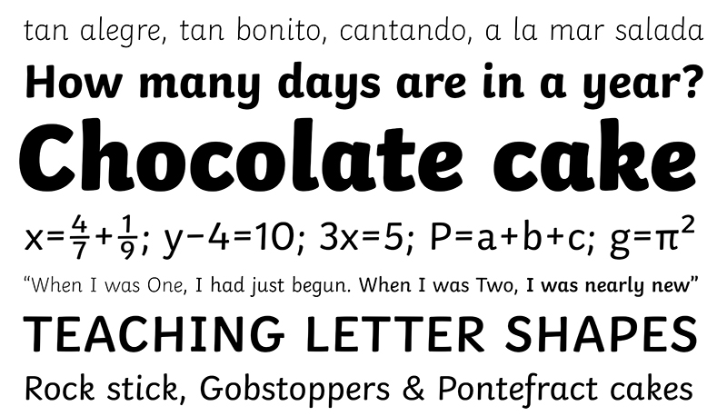
The teachers’ preferences for the simplicity of sans serif typefaces has historical roots. Sans serif typefaces, hailed by modernists during the interbellum, received an extra amount of attention after WWII when there was a need to break away from the national connotations regarding the blackletter.4 This was incorporated into type in an extreme manner, and sans serif started to dominate printed material. For modernist typographers the sans serif represented type design in its fundamental form because it resembled the ‘bare bones’ of the alphabet.5 The association with the skeletal form of the letters can be attributed to an (almost) even weight of line (resulting in low or no contrast between thick and thin parts of a letter) and the application of many interchangeable components (such as the bowls in ‘a’, ‘g’, ‘b’, ‘p’, ‘d’ and ‘q’)
Because of its simple letter shapes, sans serif was seen as the modern letter par excellence.6 The triumph of Helvetica (1957) and Univers (1957) added tremendously to the popularity of sans serif typefaces. Due to this simplicity, teachers have preferred sans serif typefaces to the present for children’s reading books because they presumed that sans serif was more closely related to the letterforms children learn to write than were serif typefaces.
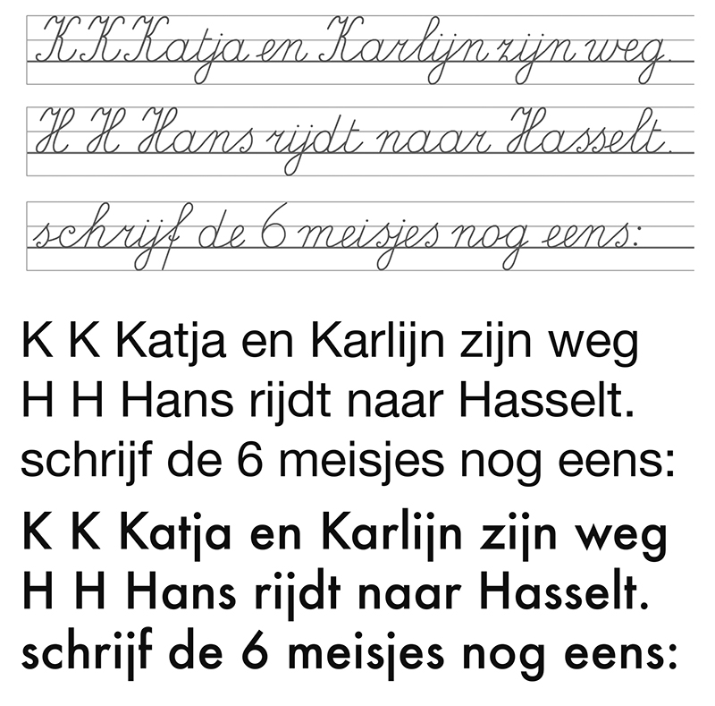
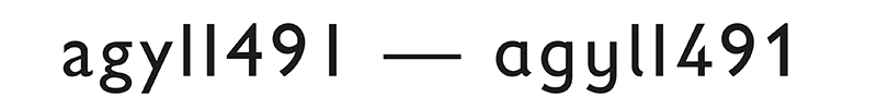
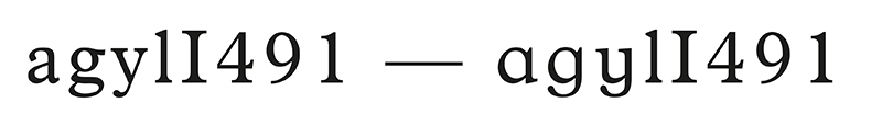
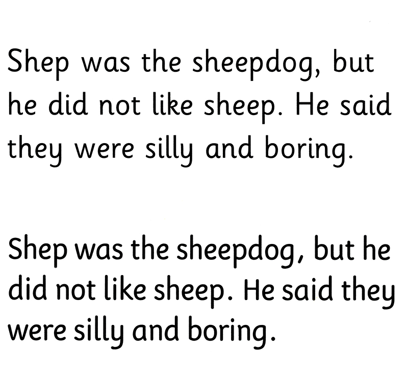
Designers created alternative letter shapes, even for serif typefaces, to meet the demand of teachers who intuitively preferred handwritten characteristics in typefaces for beginner readers.7 These specially designed letter shapes are thus directly related to children’s handwriting and are called ‘infant characters’. Infant characters were first introduced around 1920 and became more popular around 1930 with the introduction of infant characters in sans serif typefaces such as the Gill Sans. Infant characters are characterised by the single storied ‘a’ and ‘g’, the shapes of the letters ‘l’ and ‘t’, the capital ‘I’ and the figure ‘1’ and some other numbers.
Teachers were of the opinion — and some still are — that double storied a’s and g’s created difficulty in reading. Infant characters would provide a greater distinction between letter shapes and would align the letterforms for reading and writing.8 Teachers and educationalists perceived the use of infant characters in books for beginner readers as beneficial because the letter shapes look similar to handwritten characters. Sassoon, an expert in teaching handwriting to children, stated that infant characters have a positive influence on the unexperienced reader because recognition is a dominant factor when learning to read.9
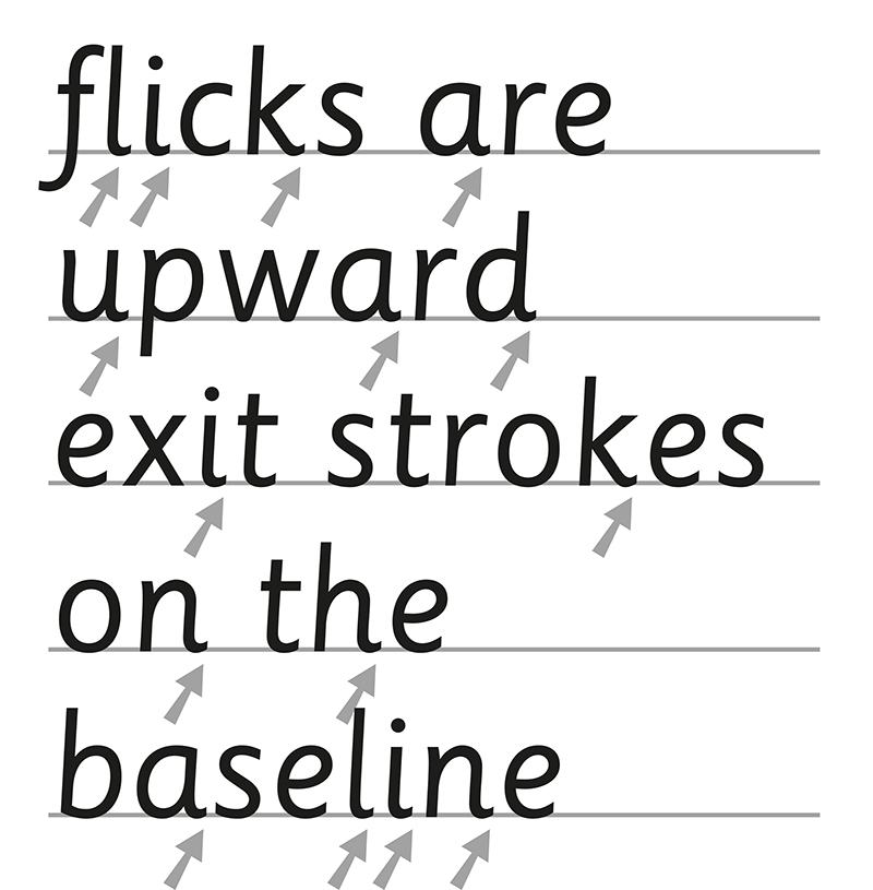
This assumption was translated into the design of letter shapes by introducing rounded terminal strokes, the addition of flicks (the upwards exit strokes on the baseline), long ascenders and descenders, which are believed to aid the identification of word images. Due to the overall roundness of the letter shapes, infant characters were considered to feel friendlier.
It is clear that most of the assumptions regarding typefaces for children by type designers and teachers were based on tradition and popularity, and were uncritically adopted by many educational publishers. Some popular fonts such as Century Schoolbook, Bembo and Plantin even added infant characters to their fonts.10
This shows that these views had an enormous impact on the typeface industry, and still do to the present day. To increase sales, even a type foundry such as Monotype extended many digital typeface families to include infant characters and added the suffix ‘schoolbook’ to their names in the 1990s.
Specially designed typefaces for children, such as Sassoon, designed by Rosemary Sassoon and Adrian Williams in the 1980s, Fabula, designed by Vincent Connare in 1999-2000, and Twinkl Sans, designed by TypeTogether in 2015 (published in 2016), were designed with the reading-writing needs of beginner readers in mind.11
Other typefaces specifically aimed at children, such as FF Schulbuch by Just van Rossum (1991), Fiendstar by Nicholas Garner (2006) and FS Me by Fontsmith (2009) have implemented the handwriting style by designing a sans serif font.
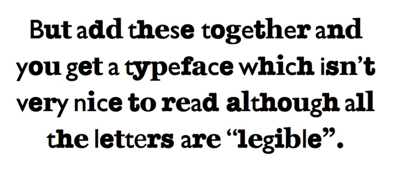
One of the dangers of the implementation of infant typefaces is that, because they translate writing visually, they do not have the overall appearance of conventional typefaces for reading. Consequently, they do not familiarise children with the type conventions of reading, as serif typefaces are used in most reading books. Familiarising pupils with printed typefaces is precisely one of the purposes of teaching children to read. In other words, specially designed typefaces may not be the right answer.12 Although teachers favour the use of sans serif typefaces because (1) they reflect handwriting qualities, (2) appear more simple, and (3) are supposedly easier to read, the practical experience of type designers teaches us something completely different.13 However, the choice of simple-looking sans serif typefaces, which are supposed to enable better communication, is in fact based more on ‘atmosphere’ and association than it is on research into their legibility.14 Although sans serif typefaces appear simpler, this seems unlikely from a typographical point of view of legibility.15 The legibility of words, in fact, depends more on the letters being decipherable and recognisable. Words are more legible when each of the individual letters is made more recognisable.16 In sans serif typefaces for instance, the letter shapes are more homogeneous, and thus less distinguishable from each other, making them less legible. On the other hand, letters that are too different from each other make a text too visible, with the result that the focus shifts from reading to viewing, which slows the reading process down.
Teachers’ views, which tend to dominate the type design scene for beginner readers, are thus highly intuitive and strengthened by tradition. The educational system, in addition to educational publishing houses and type designers, seems to follow their views. Educational publishers follow the prevailing mind-set within the educational system, which creates a vicious circle. Publishers keep publishing new material according to the teachers’ views and traditions, while the teachers keep getting the same kind of material and have no idea about alternative options. It is remarkable that non-educational publishers are less bound by the preconceptions about letters for children and provide a larger variety of typographic designs for children’s books. It seems evident that research on legibility could provide more information about ways to develop better reading materials. However, as will be argued below, most of the existing legibility research is not well adapted to the reading practices of children.
Most of the research into reading material for beginner readers that has been conducted shows little awareness of design issues affecting fonts, as well as classroom practices.17 Researchers have not differentiated between a font for testing and the fonts that children normally read. Furthermore, they tend to provide answers for other scientists and not to typographers. The available literature on such research focuses more on issues such as methods, content, motivation, experience and styles of teaching than it does on the effect of typography on legibility. Moreover, the research often intuitively supports the views of the teachers, pedagogues and educational publishers, who are not aware of the importance of type design. The few studies in which both design issues and practice were taken into account were inconclusive regarding the validity of the views of the teachers. In other words, no consensus concerning which visual attributes of text may best suit the legibility of typefaces for beginner readers exists. Debates regarding whether serif or sans serif type is easier to read, or whether infant characters should be used, thus remain inconclusive.18
Contrary to what many people think, legibility does not have a definitive or absolute meaning, which leads to much confusion. Legibility, in fact, includes many different aspects of reading, such as cognitive, visual, motoric, pedagogic, neurologic, typographic, subjective and linguistic aspects. Each research study must therefore formulate its own definition of legibility.
As stated previously, most of the research on legibility was conducted somewhat intuitively, and is problematic from a typographical point of view. Surveys amongst teachers about the most important features of type for beginner readers, for instance, revealed that teachers favoured the use of sans serif type throughout infant school.19 According to Burt, the opinion that sans serif typefaces reflect handwriting qualities better than do serif typefaces due to the uniform letter strokes still holds true.20 Griffing and Franz equated the legibility of a typeface with its structure.21 The simpler the structure (for example, sans serif), the more legible the typeface. The more complex (for example, serif or blackletter), the less legible it was considered to be.
The question of whether sans serif is more legible than is serif for a beginner reader has occupied researchers to date. Although the research question is relevant, most of the results remain inconclusive due to the test setups and test materials.22 For example, these neglect the fact that many design variables come into play, and that the presence or absence of serifs is not necessarily the only factor causing legibility effects. Overall, very little formal research on the question of which typefaces may best suit young readers in various age groups has been conducted.23 Walker stated that established typefaces for children’s reading should have generous ascenders and descenders, making a clear distinction between characters that are sometimes confused. An equally well-suited approach to typeface selection might be the absence of quirky or unusual characters. With regard to the debate between serif and sans serif, the discussion continues. In the event of using infant characters, there seems to be good evidence that these special characters are not always as legible as they are asserted to be. In contrast to printed typefaces, connected scripts and handwriting reflect psychomotoric properties. This could be problematic, because writing and reading are different activities in the brain that rely on different skills.
Moreover, scientists have rarely consulted designers in the design of their legibility/reading studies. The studies by Walker, and by Beier and Larson, who are involved in design and classroom practices, are an exception.24 In studies in which designers were not involved, the text material often seems typographically invalid.25 The studies provide little or no information about how the visual test material was presented. The test material itself is often described in the text, but it raises multiple questions from the perspective of a type designer.26 Even when the study provides images of the test material, most studies are almost always typographically incorrect. Hence, it is necessary to seek an interdisciplinary perspective on legibility research in which typographic design and scientific research collaborate (or share their mutual expertise).
Of all the skills a human being can acquire, reading is one of the most complex. Although most of us are under the impression that reading is simple and effortless, it requires years of practice to learn this skill. Because letters are not seen consciously, reading is done automatically and unconsciously, and only the content of the text is enjoyed consciously.27 The only readers who see letters as letters are typographers and font designers who design the typefaces everyone reads. Unfortunately, type designers are usually not involved in the design of the test material for reading or legibility research. Over the last five centuries, type designers have always been designing type and have always been interested in improving typefaces to provide a better reading experience, but have had little or no knowledge about legibility research.
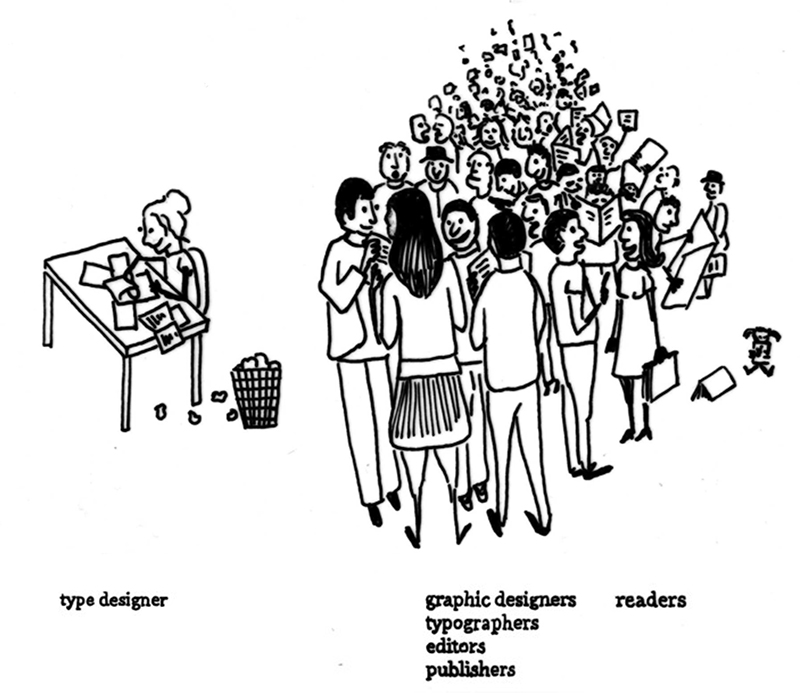
Type design is a solitary profession, which means that type designers have little or no contact with their readers. They supply typefaces to editors, publishers and graphic designers who mediate between the type designers and the readers. Although scientists do have more contact with readers and receive some kind of feedback from them, the test material is, as argued above, often typographically incorrect. Moreover, because they do not take real-life environments such as classroom practices into account, their work is of little use to type designers and other stakeholders.
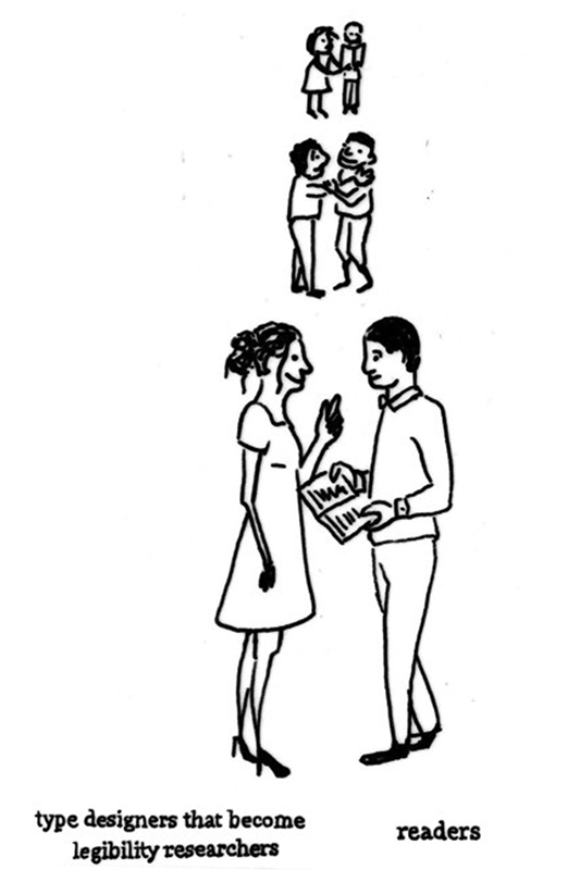
Therefore, legibility research is mainly conducted by scientists who do not have sufficient knowledge of typography on one hand, and typefaces are designed by typographers lacking feedback from the readers on the other. Why not combine the knowledge and experience of both expert groups to strengthen both legibility research and the design of suitable typefaces for beginner readers? Designers who have embarked on scientific legibility research only very recently have started to do so in one of two ways. They have either chosen to collaborate closely with a scientific researcher, or they have decided to merge both positions — that of the researcher and type designer — in one person. This kind of research could be characterised as design studies, because it combines scientific and artistic survey methods.28 As a design researcher, one tries to combine the objectivity of scientific research with the sensibility of design, which is based on creativity, intuition and visual judgment. In other words, the design researcher aims to connect an artistic reflective attitude with a scientific analytical approach. One advantage of this kind of research is that it bridges the gap between the type designer and the reader. Another advantage is that design research is able to construct the basis for proper design decisions via accurate and controllable research results.
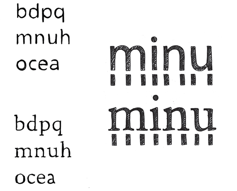
Very little design research has yet been conducted within the context of typefaces for children’s reading. It is my personal aim to become a design researcher who combines the approaches of the type designer with those of the scientific legibility researcher. Working closely with different stakeholders in my PhD research on the legibility of typefaces for children with low vision made me aware that it is necessary to reflect on natural reading environments in the test setups to the greatest degree possible.29 The studies that I designed aimed at developing specialised typefaces that could function as the starting point for further exploration of and in-depth research into typefaces for beginner readers. I used several typefaces and conducted both experimental (quantitative evaluations) and subjective (qualitative evaluations) legibility research to study the reading skills and reading experiences of visually impaired children.30 I selected children with low eyesight, as well as children with normal eyesight, who were between five and ten years of age. This experimental legibility research showed that a sans serif typeface (Frutiger), when compared to a serif typeface (DTL Documenta), was not necessarily more legible for beginner readers with normal eyesight.31 Children with normal vision make fewer reading mistakes when the serif typeface DTL Documenta was used. At first, this result seemed somewhat atypical, since children mainly read sans serif typefaces in daily classroom practice. Although the subjective legibility research showed no significant results, the dialogue with the children revealed other relevant information. The subjective legibility research showed that beginner readers were conditioned by their daily reading material quite early, and that children did not describe serif and sans serif in terms of the ‘feet’ at the top or bottom of the letters. They associated sans serif with writing and serifs with reading (for example, books and newspapers). From their perspective, they thought that serifs were difficult to reproduce. With regard to infant characters, I found results comparable to those of Walker.32 Children did not seem to have problems with non-infant characters in type. An innovative conclusion of my PhD thesis was that we should study typefaces with and without serifs in terms of the rhythm of the typeface. In general, the rhythm in serif or sans serif typefaces is presented with the help of a stripe pattern that is formed by the successive vertical letter strokes.33 It was revealed that sans serif typefaces are heterogeneous (more distinct) in rhythm and homogeneous in their letter forms (because of possible mirroring), whereas serif typefaces are more homogeneous in rhythm and are more heterogeneous in terms of the letter forms. The fact that the letter shapes of a serif typeface are more distinguishable from each other may explain why children with normal vision make fewer reading errors.
Since children did not describe the differences between serif and sans serif in terms of the ‘feet’ of the letters, it might be valid to conclude that the rhythm is more relevant. Normally sighted children performed better with a homogenous rhythm, whereas visually impaired children performed better with a heterogeneous rhythm. Although it does not seem evident at first sight, it might be possible to synchronise scientific method and design research on an on-going basis. Scientific research is a useful source of information and inspiration for designing the test material, which in turn is tested in a scientifically correct manner. In my approach, I combined the roles of designer and scientist. However, it is not always necessary for a type designer to become a design researcher. The strength of interdisciplinary work lies in the combination of the two disciplines. The collaboration between type designers and scientists in the field of legibility research could yield an equally productive research design.
Reading occurs without a conscious act of seeing.34 Letters (and typography) are unique in that they, whilst consumed and enjoyed, remain unseen. The letters themselves are not enjoyed consciously. On the other hand, type forms are the foundation of legibility and thus of the reading process. If the details within the fonts do not matter during reading, as some reading psychologists believe, it would be unnecessary to compare different fonts, because this would yield similar results with regard to legibility.35 This is, however, not the case. The visual details and the design of typefaces affect the legibility of a typeface.36 By integrating typeface and scientific reading research, a new and productive relationship between the scientific researcher and the type designer could be created. This would be beneficial for scientific research, as well as for the design of new typefaces.
Much of what we know about typefaces for children’s reading is based on prejudices and the force of habit; such knowledge is often quoted uncritically and is used as a writing guideline for practitioners. These guidelines are an oversimplification of the facts and are based more on feelings and tradition than they are on typographic knowledge.37 It is, therefore, essential that designers begin to collaborate with scientists to develop a clear typographic mind-set. Apart from few exceptions (such as the studies by Walker), most research on the legibility of typefaces for children’s reading refers to questionable experiments and repeatedly extrapolates the same doubtful guidelines. Unfortunately, most of these studies are read and quoted by people who are not well-trained in typography. Type designers follow existing pedagogic clichés in their design of typefaces for beginner readers. Design researchers could contribute to improving the typographic design of children’s books by merging the perspective and knowledge of type designers with that of legibility researchers. An interdisciplinary approach may lead to better informed research results for all parties, namely designers and scientists, as well as for other stakeholders — not least beginner readers, in this case.
Dr. Ann Bessemans is a graphic designer, working as a legibility specialist within her research group READSEARCH at PXL-MAD and Hasselt University. At the same institute she also teaches typo-graphy and type design. Her work contributes to legibility research and international type design. It provides the practice of typeface design with a scientific foundations and provides interesting data, by which type designers can better accommodate to the wishes of the reader, both normal as well as impaired. Bessemans received several grants from Microsoft Advanced Reading Technologies (USA). Ann was a finalist in in the ‘New Scientist Wetenschapstalent 2015’ and is an elected member of the Young Academy. Bessemans is frequently workshop leader and lecturer at international typographic and interdisciplinary conferences.
There are no comments